Spring 2026 isn’t holding back. Forget "I’ll just wear black today"—the runways are bursting with rich violet, vibrant aquamarine, and bold primary colors, all dialed up to the max. What’s even more exciting? It’s not just about wearing bright shades, but how you pair them. If you’ve been a bit wary of color, buckle up—these combos might seem unusual at first, but that’s exactly why they work. Let’s break down the 7 key pairings for 2026 and why they shine.
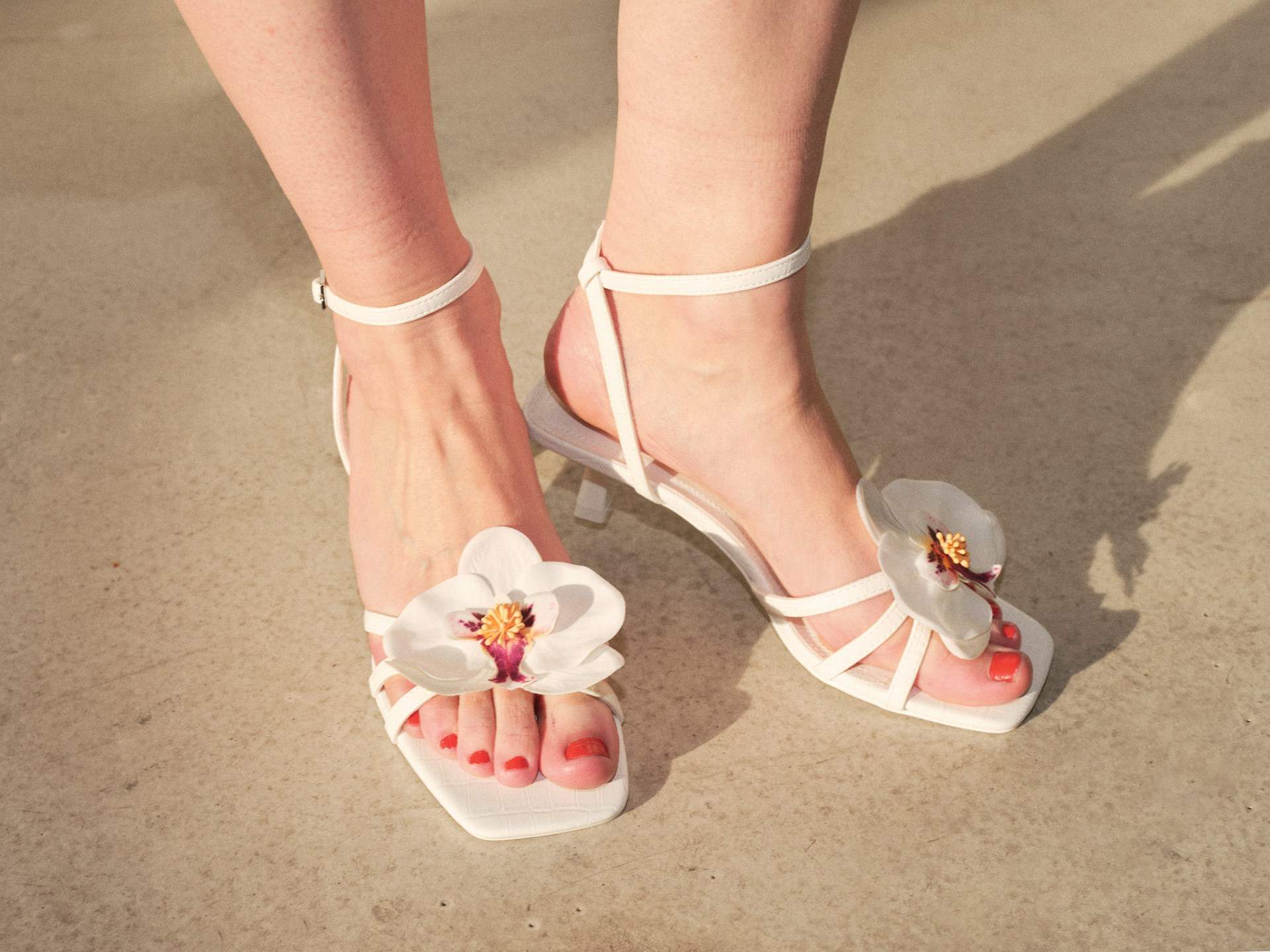
Powder Pink + Red
The season’s absolute favorite. Powder pink can sometimes feel too innocent or even girlish on its own, but paired with a bold, vibrant, or deep red, the whole look instantly matures. On the 2026 spring runways, including Chanel’s, powder pink tops were matched with dramatic burgundy skirts. The result? Romantic yet intentional. Soft but strong.
Why does it work?
Pink and red come from the same color family, so they harmonize beautifully, yet have enough contrast to keep things exciting. If you remember just one combo for 2026, make it this one.
Sage Green + Cream
This pairing feels like fresh spring air. Sage green is calm and nature-inspired, while cream (a soft, buttery yellow) adds warmth and light.
Why does it work?
Both tones are muted and powdery, so they don’t compete. The effect is elegant, refined, and incredibly wearable, perfect for the office or a weekend brunch. Pro tip: if you’re wary of yellow, start with cream accessories alongside a sage outfit.
True Red + Cobalt Blue
Pure, saturated red paired with equally bold cobalt blue might seem intense at first, but that’s exactly what makes it pop.
Why does it work?
Primary colors always harmonize, but wearing both at full saturation is a fashion statement. Energetic, confident, and eye-catching. If you’re not ready for a full color block, start with a red dress and cobalt shoes.
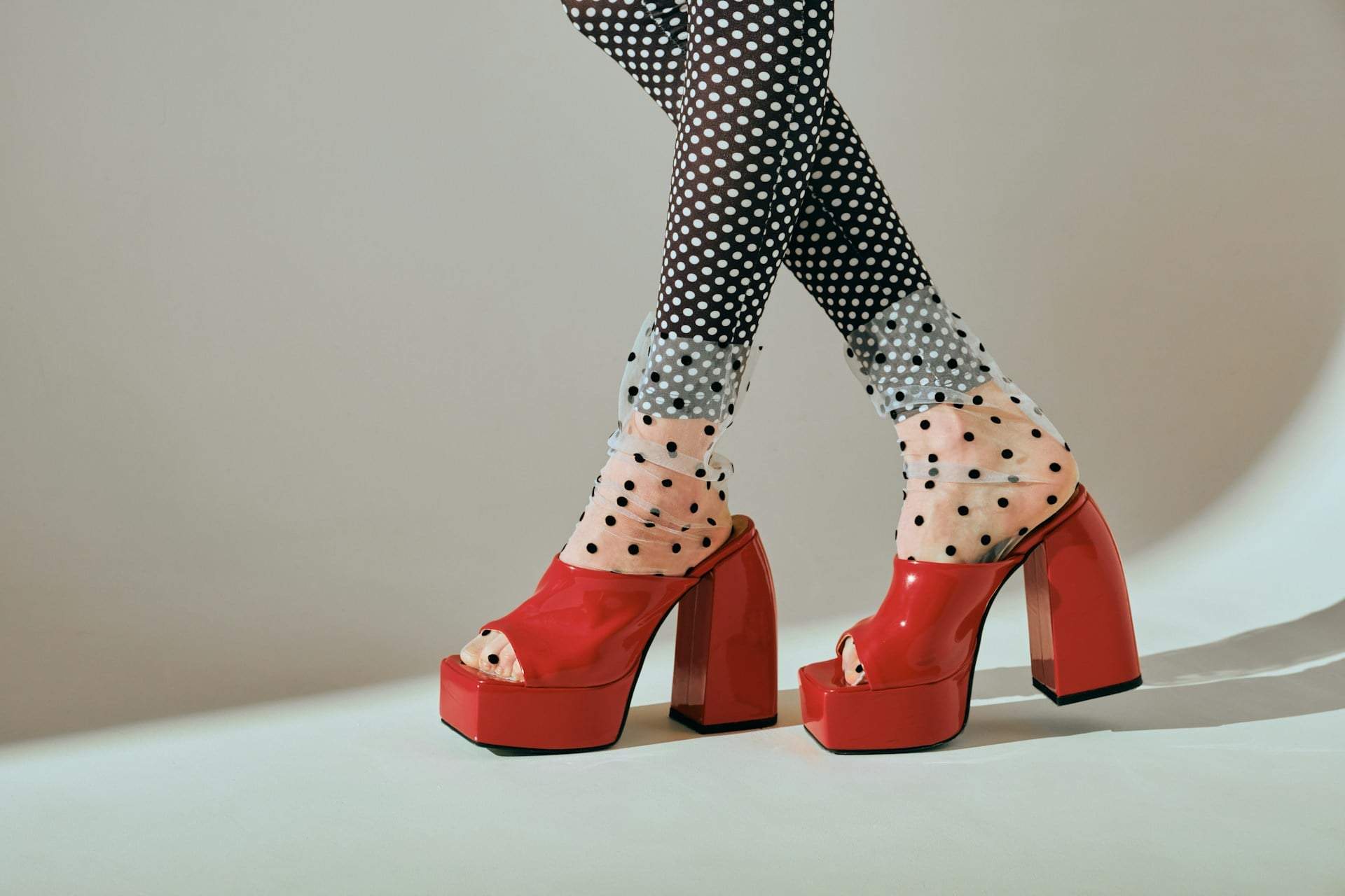
Burgundy + Blue
This combo is one of the season’s most distinctive yet elegant pairings. Deep burgundy creates a rich, passionate vibe, while blue—whether royal or deep ocean—offers a cool, sophisticated contrast.
Why does it work?
The warmth of burgundy and the coolness of blue create exciting tension, while both are rich, powerful colors. The contrast is strong but not loud—more deliberate and stylish. This pairing shines in elegant evening looks but also makes a confident statement in bold street style.
Orange + Pink
Sunset vibes all day long. Pink and orange together vibrate with warmth and playfulness.
Why does it work?
Both are warm tones, so they’re naturally harmonious. The key is balancing saturation—if one is very bright, the other can be a shade softer.
Deep Brown + Blue
Brown isn’t just a background color in 2026. A rich chocolate brown base perfectly highlights a vibrant blue.
Why does it work?
Brown brings stability, while blue adds a modern twist. This duo is perfect for those who want to add color to their wardrobe without going over the top.
Cream + Burgundy
This combo is sophisticated yet bold. The softness of cream and the depth of burgundy create an elegant balance.
Why does it work?
The light–dark contrast adds drama, while the warm tones keep the overall look harmonious.
The rule? There’s no rule. Colors aren’t whispering—they’re shouting. The trick isn’t to tone them down but to pair them thoughtfully. If you pick a combo that seems like it "shouldn’t work," chances are it’ll be the coolest look around.