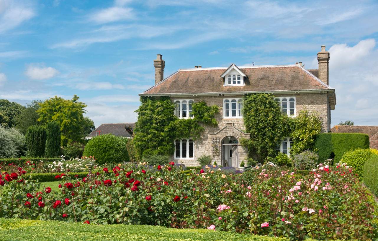
The color of your living room does more than look good — it shapes how you feel the moment you walk through the door. According to interior designers, the right shade can pull a space together, make furniture pop, and even improve how light feels in a room. This year's trends are leaning firmly toward natural, warm tones and colors that have real character without feeling overwhelming.
Whether you're planning a full repaint or just looking for inspiration, here are the ten living room colors worth considering right now.
Warm off-white
A softer take on the classic white. Creamy, slightly warm off-whites feel far more welcoming than cool, bluish whites. They give you a bright, airy space without that clinical, sterile edge. A great base if you want light but not stark.
Greige (the grey-beige blend)
One of the most versatile shades you can choose. Greige manages to feel both modern and cozy at the same time. It pairs effortlessly with wood, textiles, and even bolder accent pieces. There's a reason it's been a consistent favorite for years — it simply works.
Sand and soft beige
Natural neutrals are still leading the way. Sandy wall tones bring genuine warmth to a room while letting your furniture and accessories do the talking. They're understated in the best possible way.
Deep forest green
One of the most striking yet calming shades of the moment. Green creates a sense of connection to nature and looks especially beautiful alongside plants, wooden furniture, and gold accents. It's bold, but it breathes.
Dusty blue
Forget bright, saturated blues — this year it's all about muted, smoky blue tones. They feel elegant and soothing, and they work surprisingly well even in smaller rooms because they don't close the space in. Think quiet confidence on a wall.
Warm grey
Classic grey hasn't gone anywhere — it's just evolved. The cold, stark greys are giving way to warmer versions with hints of brown or beige, creating a much friendlier, more inviting atmosphere. It's the kind of grey that actually feels good to live with.
Powder pink
Surprising, but increasingly popular — and not in a childish way. Muted, dusty pinks make for a refined, elegant backdrop, especially when paired with light-colored furniture. Done right, it's quietly sophisticated.
Terracotta and warm earth tones
The trend for nature-inspired shades — terracotta, caramel, cinnamon — is only getting stronger. These colors add real depth and richness to a room, and they're particularly stunning in larger living spaces where they can fully breathe.
Dark, dramatic grey or anthracite
If you want a living room with serious impact, deep greys and near-blacks are worth considering. With the right lighting, they create an atmosphere that feels polished and almost hotel-like — moody in the best sense of the word.
Soft peach and pale orange
Gentle, sun-warmed shades that bring a cheerful energy to a space without ever feeling loud. These tones work especially well in living rooms that don't get a lot of natural light — they borrow warmth from nowhere and give it back generously.
The good news is that this year's palette is wide enough for every kind of home. Whether you lean toward clean minimalism or rooms with more personality and color, there's a shade here that fits. And ultimately, that's the only thing that matters: not what's trending, but what makes you feel good in your own space, every single day.