Before I found out Pantone’s 2026 Color of the Year, I was sure to expect something unexpected—after all, recent years have been full of bold, vibrant shades. I knew the next color had to outshine them. But I never imagined such a surprise. Pantone chose the 11-4201 Cloud Dancer shade for 2026, described in their press release as “veil-like soft, balanced” and “ethereal”. Essentially, they picked white, which caught many off guard since it’s often not considered a real color. (We’ll dive into that debate later!) This decision marks a huge shift from last year’s choice (Mocha Mousse) and goes against the rich, pigmented trend forecasts we’ve seen. Let’s explore why the global color experts picked such an unexpected shade and what it could mean for the future of home design.
Why Did They Choose Cloud Dancer?
Laurie Pressman, Vice President of the Pantone Color Institute, and Leatrice Eiseman, its Executive Director, explain that the color choice isn’t made in a single yearly meeting. It’s a continuous, thorough research process.
“We constantly observe our surroundings and carefully study what’s happening around us,” Pressman says. “We look at what we see, what we feel, what keeps resurfacing. We talk to people about their experiences and desires. It’s like an anthropological study.”
Pressman and Eiseman note that people today increasingly want to escape the overload of modern life and crave simplicity. “We’re not saying to go back 50 years,” Pressman adds. “We’re exploring how to simplify today’s life so we’re not overstimulated or overwhelmed, and so there’s less noise. How can we live more quietly, with less stress, more joy, and ease?”
This mindset led to selecting Cloud Dancer, which Pressman describes as “like a breath of fresh air.” Pantone says the color reflects our desire to shed excess and toxic influences and move toward a more harmonious, content future. It’s also a symbol of new beginnings. “That’s a powerful message,” Pressman says. “Cloud Dancer expresses our wish for a clean slate. It’s like a blank canvas freeing the mind for something new.”
But Is White Really a Color?
We have to answer the obvious question: is white truly a color? Many designers say yes, and Pantone agrees—with some nuances. “It depends on how you look at it,” Eiseman explains. “In light, it’s like a prism containing all colors. As a pigment, it means the absence of color. So it depends on perspective, undertones, and the technology displaying it.”
“The key is that every color evokes emotions,” she continues. “Whether from light or pigment, the human mind perceives it as an emotional response.”
In other words: if it triggers an emotional reaction—black, white, or anything in between—it’s fair to call it a color.
What Does This Mean for 2026 and Future Home Design Trends?
It’s important to remember Pantone’s choice influences not just home decor but also fashion, beauty, technology, and even the automotive industry. But its impact is especially strong in decorating.
The question arises: if everyone celebrates color, many rooms are filled with vibrant tones, and Instagram is buzzing with rich hues, how does a “white” Color of the Year fit in?
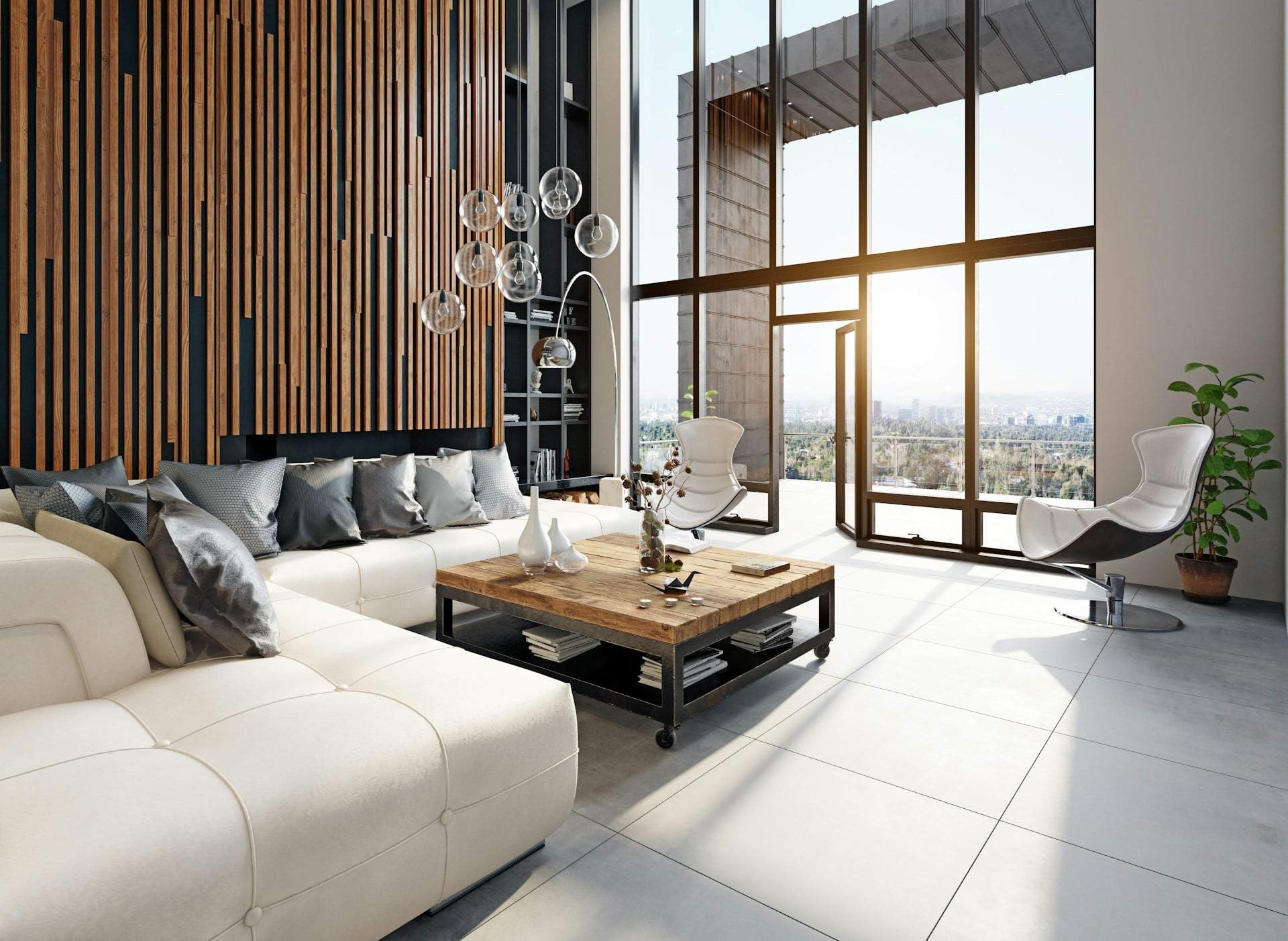
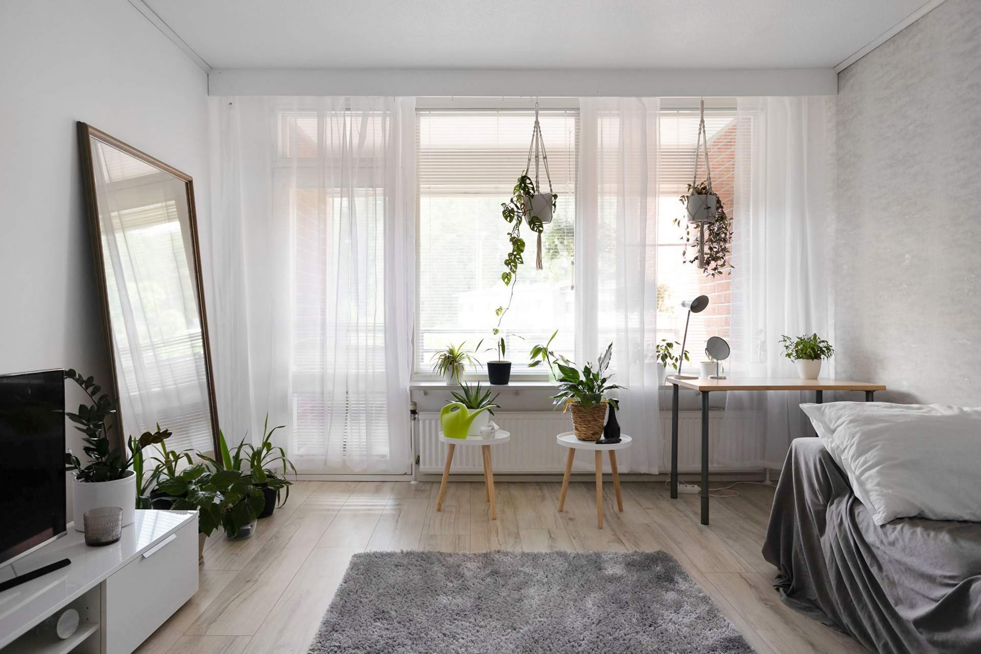
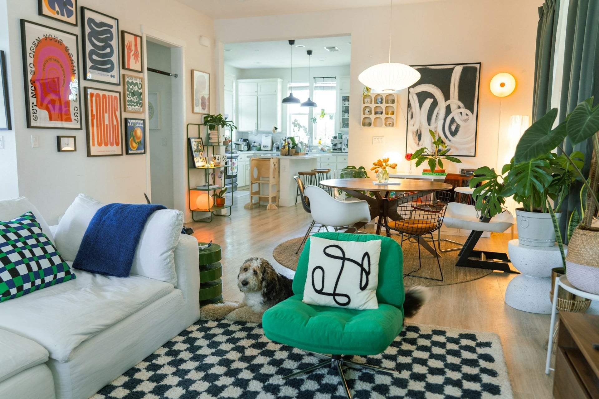
Pressman and Eiseman say there’s no contradiction. Cloud Dancer can easily coexist with colorful trends. White is incredibly versatile, works beautifully in any color setting, and doesn’t need to take center stage. “You can bring it in other ways; no one says it has to be monochrome,” Pressman explains. “It works as a backdrop, sofa shade, or even small accents.”
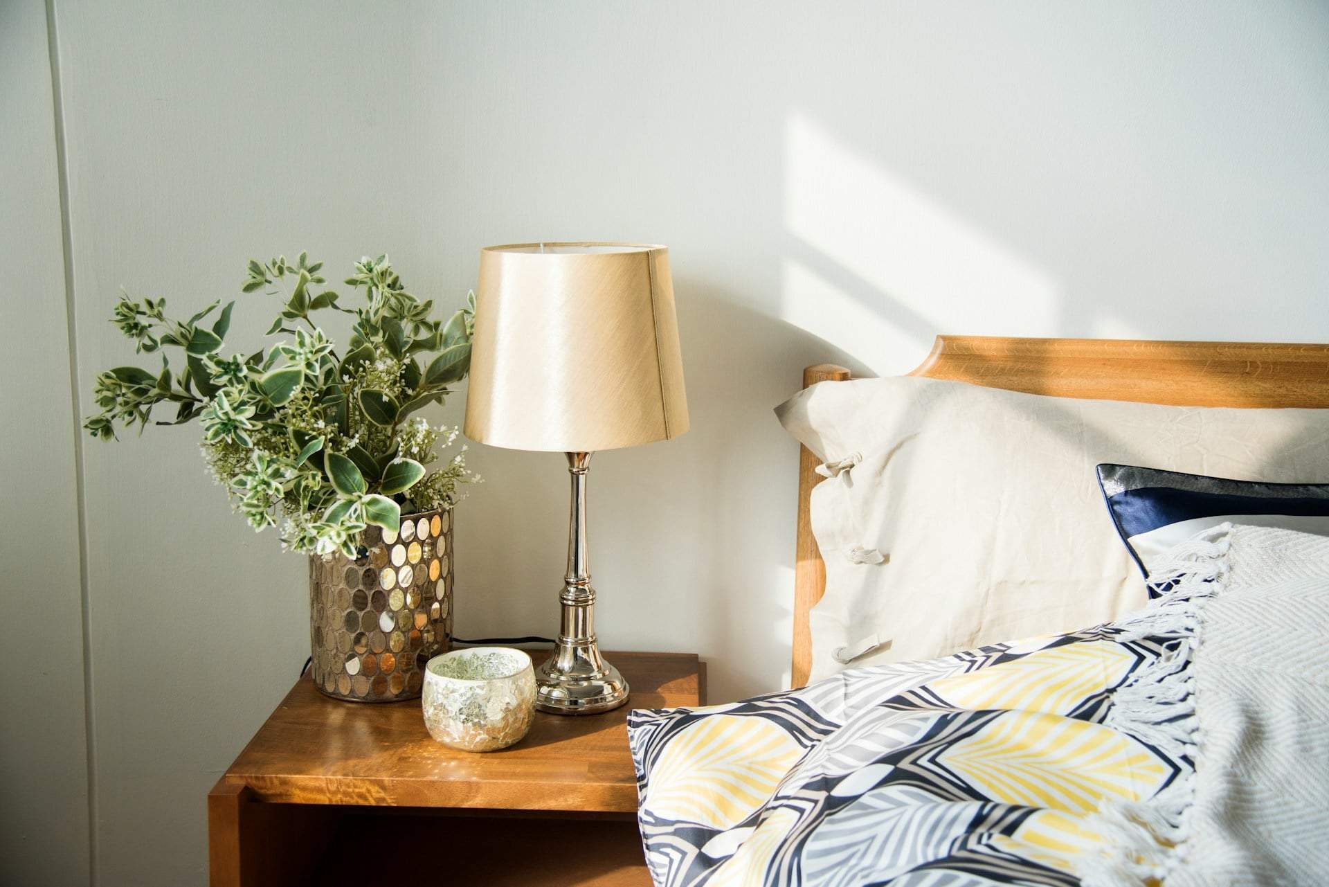
And indeed: white is probably the most commonly used wall paint color worldwide. It’s a real, practical choice and more timeless than anything else. Pressman and Eiseman describe Cloud Dancer as a true neutral white with balanced warm and cool tones. “It’s a natural white that radiates calm and a welcoming vibe,” Pressman says. “It’s reassuring for both consumers and designers because it won’t be loud or distracting.”
The color aims to promote genuine relaxation and quiet focus in a noisy world. Plus, it’s a shade that will never go out of style, something we all appreciate when planning our homes for the long haul.
In Pressman and Eiseman’s words: it’s an “everlasting color.”