When faced with too many options, picking colors for your home can feel like a real challenge. If you’re tired of staring at paint samples, the color wheel is a super simple tool that helps you figure out which shades naturally go together.
Every décor color combo can be mapped out based on where it sits on the color wheel. This circle charts the rainbow hues and breaks them down into 12 core shades: three primary, three secondary, and six tertiary colors. Mastering the color wheel theory opens up a world of combinations and makes it easier to choose colors that truly fit your home.
How Does the Color Wheel Work?
The color wheel is divided into 12 slices, each representing a color family: three primary, three secondary, and six tertiary colors.
- Primary colors: red, blue, yellow. These are pure colors that can’t be created by mixing others, and all other colors come from these.
- Secondary colors: orange, green, purple. These are blends of primary colors (for example, red + yellow = orange).
- Tertiary colors: mixes of a primary color and its neighboring secondary color. The more you blend, the softer the result. Examples include red-orange, yellow-orange, yellow-green, blue-green, blue-purple, red-purple.
How to Build Your Color Palette Using the Color Wheel
The color wheel segments help you mix colors and create varied, contrasting palettes. There are four basic color schemes:
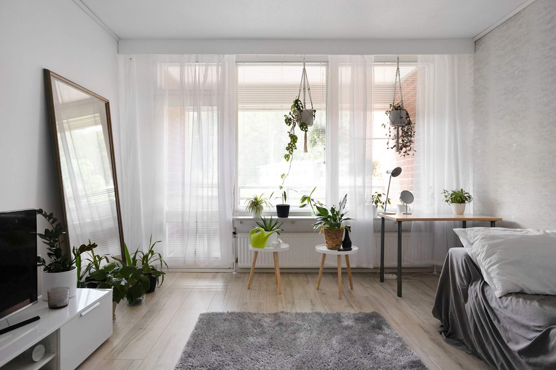
1. Monochromatic (Tone-on-Tone)
This tone-on-tone approach uses different lightness levels of a single shade (lightened with white, darkened with black). Think light blue, sky blue, navy blue.
Tip: play with textures — a room isn’t just about color shades but also different materials. Try a knitted throw or a rug. Using neighboring colors on the wheel can brighten the look: pink, for example, feels more exciting with coral or mauve accents.
2. Analogous Color Scheme
This palette uses colors next to each other on the wheel (like orange, yellow, green). It creates a calming, harmonious vibe. Use the main color (dominant shade) on walls or large furniture, and smaller accents in the complementary colors. The 60:30:10 rule works well here — 60% main color, 30% first accent, 10% second accent.
3. Complementary Color Scheme
This scheme pairs two colors that are opposite each other on the wheel (like blue and orange). Energy and contrast are key here. Use the dominant color on walls, and the other mainly in accents so it doesn’t overwhelm the space. Make sure the colors have similar tones for a balanced, harmonious result.
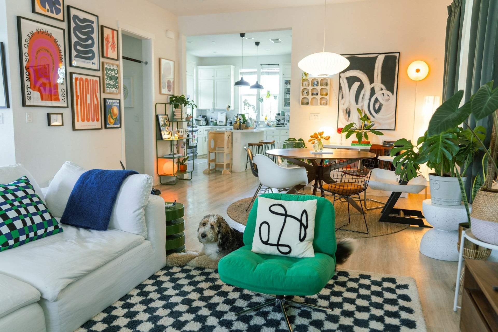
4. Triadic Color Scheme
Three colors evenly spaced on the wheel (like turquoise, fuchsia, yellow-orange) create a lively, energetic, and cheerful mood. Use different shades and tones to keep the colors from feeling too bold. Always pick one color as dominant and use the other two as accents.
Extra Tips
It’s smart to play with color temperature — don’t stick to only warm or cool tones. One type can be your main color, but always balance it with a shade from the opposite group for a well-rounded, inviting look.