The living room is the central space of our home: it’s where we relax, chat, work, or dive into a good book. While furniture, textiles, and decor play a big role in the vibe, the wall color makes the biggest impact. A poorly chosen shade can turn even the most stylish setup cold and lifeless.
Margaret Donaldson, founder of MDI Luxury Design in Charleston, shared with Southern Ling that some colors just aren’t ideal for living rooms if you’re aiming for a cozy, friendly atmosphere. It’s not about style but the psychological and visual effects—these colors can make a space feel tense, unsettling, or cold.
1. Neon Green – Too Bold and Stimulating
Neon shades are bright and intense, naturally drawing your eye to the walls. But a living room should be a place to unwind, not to overwhelm with excessive visual stimulation. Too much bright green can make people feel anxious and restless, making it harder to relax.
Tip: If you love green, go for natural, earthy tones. They’re calming and blend beautifully with furniture, plants, and natural light.
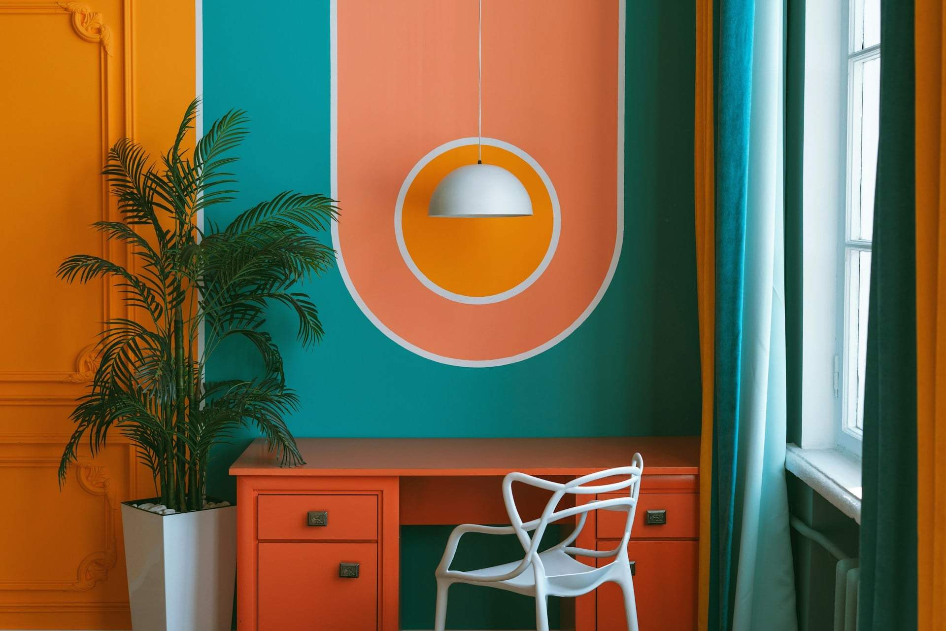
2. Bright Pink – Too Energetic, Hard to Relax Around
Bright pinks, especially vivid ones, have an energizing, stimulating effect that works better in kids’ rooms, bathrooms, or as small accent areas. In a living room, they can create tension and make it tough to unwind.
Tip: To bring pink into your living room, choose pastel or warm shades. They soften the space and create a welcoming vibe. A throw pillow, lampshade, or artwork can add pink’s energy without overpowering.
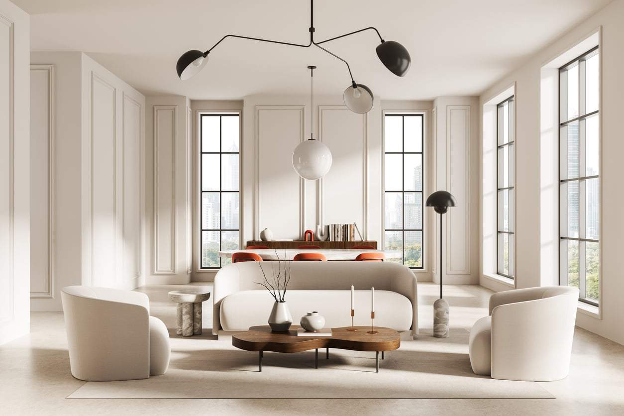
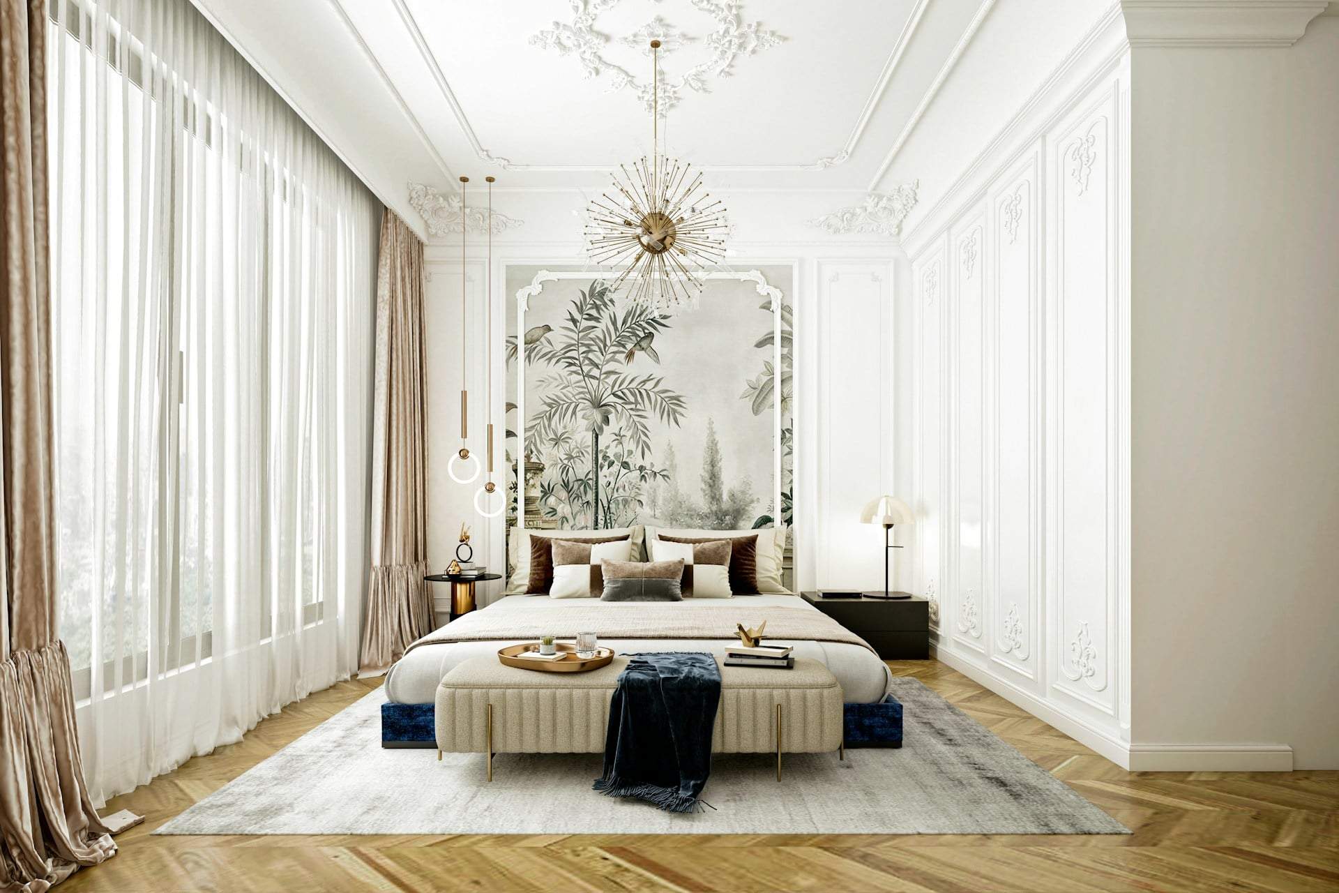
3. Pure White – Sterile and Lifeless
Bright white walls often look clean and modern but can easily feel cold and institutional. In a living room, where warmth and coziness matter, stark white doesn’t deliver the friendly atmosphere that natural light and warm-toned furniture create together.
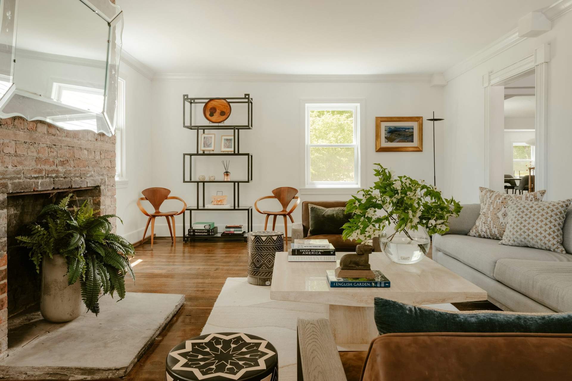
Tip: Warm whites—those with yellow or cream undertones—work better with natural light and create a calm, inviting mood. They still feel clean but are far less lifeless, making your living room feel truly cozy.
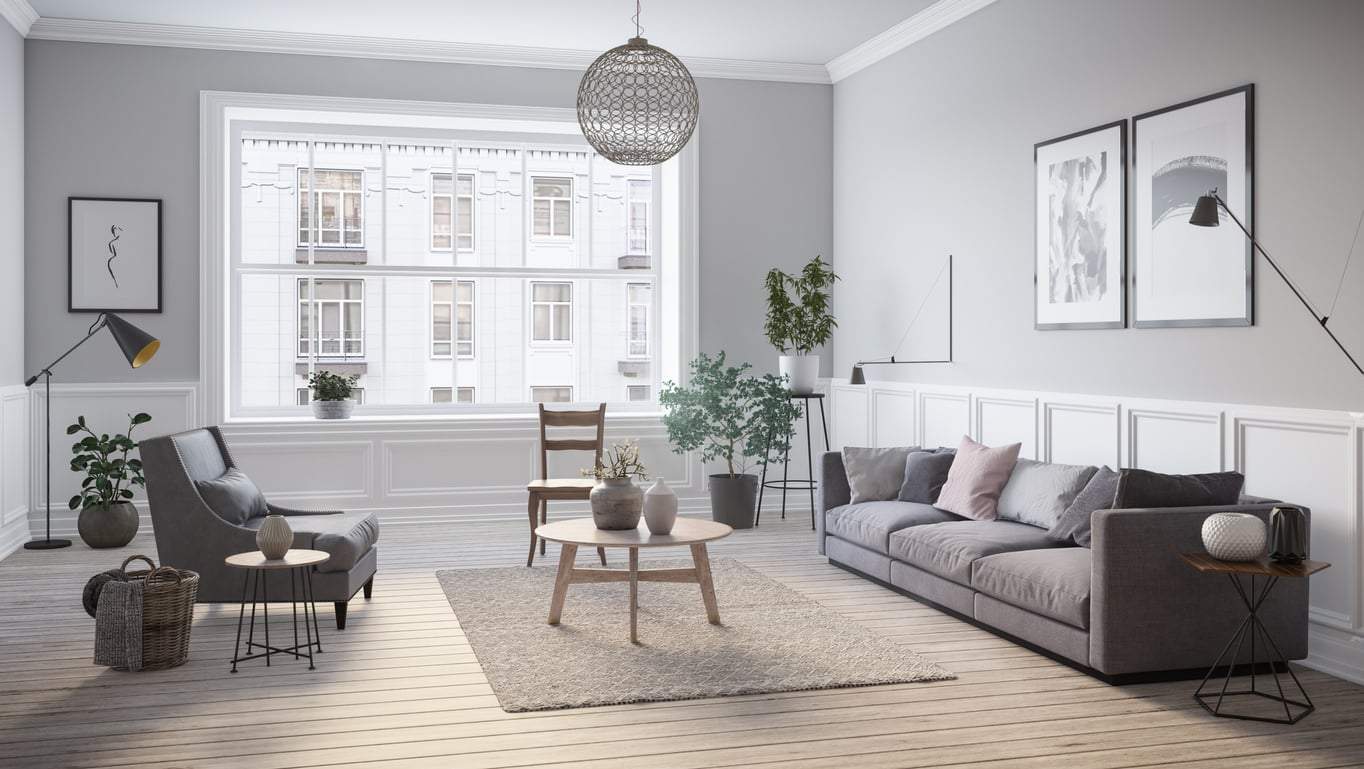
4. Bluish Gray – Cold and Formal
Bluish gray is elegant and modern, but in a living room—especially without much natural light—it can feel cold and formal. This makes the space less inviting and comfortable.
Tip: If gray is your pick, warmer, earthier tones feel friendlier. These shades are neutral but make the space cozier and calmer while keeping an elegant look.
5. Bright Lime Yellow – Jarring and Intense
Too bright, neon yellow is visually overpowering and can cause restlessness. In a living room meant for relaxation and close moments, this shade can feel unsettling.
Tip: Soft, creamy, or pastel yellows create a warm, pleasant mood. These colors feel friendly and inviting, especially with natural light, making your living room truly cozy.
Choosing living room colors is more than an aesthetic choice: walls communicate mood, calm, friendliness, or tension. Neon, bright pinks, stark whites, bluish grays, and neon yellows can easily spoil that cozy feeling. Opt for muted, warm, natural tones that highlight your furniture’s beauty and make your living room a truly inviting, intimate hub.