Pantone kicked off the new millennium in 2000 by announcing the first-ever “Color of the Year” – Cerulean Blue. The idea caught on so quickly that it became a beloved tradition. Since then, countless paint and design brands have joined in, each sharing their own take on the colors that will set the tone for the coming 12 months.
These announcements don’t just inspire—they reveal how our tastes evolve and where home decor trends are headed. As the new year begins, the big question is: what vibe will 2026’s color palette bring?
Iokasti Sotirakopoulou, an interior stylist at Livingetc Design Lab, sees this year’s picks moving clearly toward richer, deeper, and more tactile shades. “The whole palette carries a warmth—from earthy mineral tones and fruity hues to neutrals that echo tailored suits.”
These colors express themselves without shouting; dramatic yet calming. They create atmosphere rather than noise in a room. Expect to see deep, almost brownish burgundies, eggplant tones, and mysterious dark teals, alongside growing spaces for caramel browns and warm ochres with orange hints.
Miaad Latoof, another stylist at Livingetc Design Lab, adds: “There’s a rising demand for spaces that radiate stability and warmth in our fast-paced lives. These colors craft a deep mood and bring genuine harmony to the home.”
Iokasti sums it up: “We’re decorating with uplifting colors—shades that dress the space and emotionally recharge it.” Let’s explore the colors announced for 2026 so far—and how they’ll influence home decor.
Pantone: Cloud Dancer
At first, it might surprise you, but Pantone chose Cloud Dancer, a warm cream-white, as its 2026 Color of the Year. After a wave of deep, rich shades, this subtle choice perfectly fits the upcoming year’s mood. Pantone describes Cloud Dancer as an airy shade symbolizing calm and quiet reflection in a hectic world. It’s a solid foundation—a reliable “blank canvas” that lets every other color shine. This shade calms the mind, sharpens focus, and opens space for creativity and fresh ideas. Its understated nature makes it ideal for minimalist, Japandi, and Scandinavian styles—so these trends will stay strong in home decor next year.
Little Greene: Adventurer
Little Greene was among the first to embrace the eggplant purple trend. Adventurer is a rich yet muted shade that feels both bold and familiar—the kind of color many of us are drawn to right now. “Muted but saturated tones instantly make a space feel cozy and personal,” says Miaad Latoof. These colors don’t just fade into the background; they create real mood and space. They pair beautifully with marble and wood, adding a touch of vintage luxury to your home.
Benjamin Moore: Silhouette
Benjamin Moore picked a dark gray with warm brown undertones called Silhouette. This shade is far from the cold grays of the past: it’s deep, warm, and versatile. These darker, calm tones are not only bold but also highlight architectural details beautifully while gently absorbing light.
Graham & Brown: Divine Damson
Divine Damson is a rich, deep red that extends the eggplant purple trend with even more depth. In some lights, it feels warm and inviting; in others, darker and more dramatic. The brand even designed matching wallpaper, so you can build a whole mood around it.
Glidden: Warm Mahogany
Glidden’s 2026 color is Warm Mahogany, a classic, cozy reddish-brown. Though not available in Europe, it’s a great source of inspiration, showing how to bring rich colors into neutral settings. According to the brand, this shade can be either the star or a supporting player—depending on what the space needs.
Bluestar: Purple Violet
It’s not just paint brands shaping the colors of the year anymore: Bluestar chose Purple Violet for kitchen appliances. This shows purple is making a strong comeback—even in the kitchen. The choice hints at warmth, richness, and bold yet soothing design.
Mylands: Burlington Arcade
Burlington Arcade is a dark teal shade that sits between green and blue. Though it belongs to the cool color family, its complex undertones give it a surprisingly warm feel. It works especially well in living rooms, home offices, or bedrooms where comfort is key.
IKEA: Rebel Pink
IKEA went bold with Rebel Pink—a playful, powerful, and unapologetically maximalist choice. Whether on walls or as accents, it brings life to neutral spaces—so no need to give up on dopamine-boosting decor in 2026!
Earthborn: Freckle
Earthborn chose a peachy-orange shade called Freckle. It’s warm, grounded, and surprisingly versatile—plus it reflects the brand’s sustainable philosophy. This color fits beautifully in many spots, making spaces feel cozier.
C2: Epernay
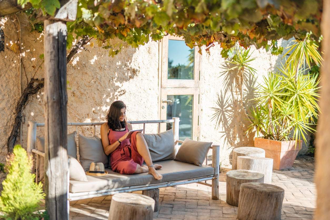
Epernay is a soft, earthy ochre-beige shade that evokes sunlit stone walls. It’s a classic European tone that speaks to storytelling, love of detail, and the personal touch of home. So next year, relaxing at home and vintage influences will still play a big role.