When you step into a room, glance at your wardrobe, or look at your salon walls, colors speak volumes. In 2026, the trend is clear: it’s not about loud shades, but warm, earthy, and distinctive tones. Experts say next year’s palette features hues that are not only trendy but also create a lasting cozy atmosphere. Keep reading to see how these colors can bring calm, harmony, and inspiration into your everyday life.
Burgundy and Deep Reds
Burgundy, wine red, and dark cherry tones will take center stage again in 2026. Not in a flashy way, but with a velvety depth. Experts say this shade brings elegance, character, and confidence to any space. In home decor, it works beautifully on accent walls, door frames, or furniture pieces like a burgundy chair or textile that instantly sets the mood. For salons or studios, this color signals that "important things happen here," whether it’s a feature wall behind the guest’s seat or a classroom wall. Just be careful not to overdo it—too many burgundy walls can make a space feel heavy and dark. Pair it with light, warm neutrals (cream, sand) or natural materials (light wood, linen) for balance.
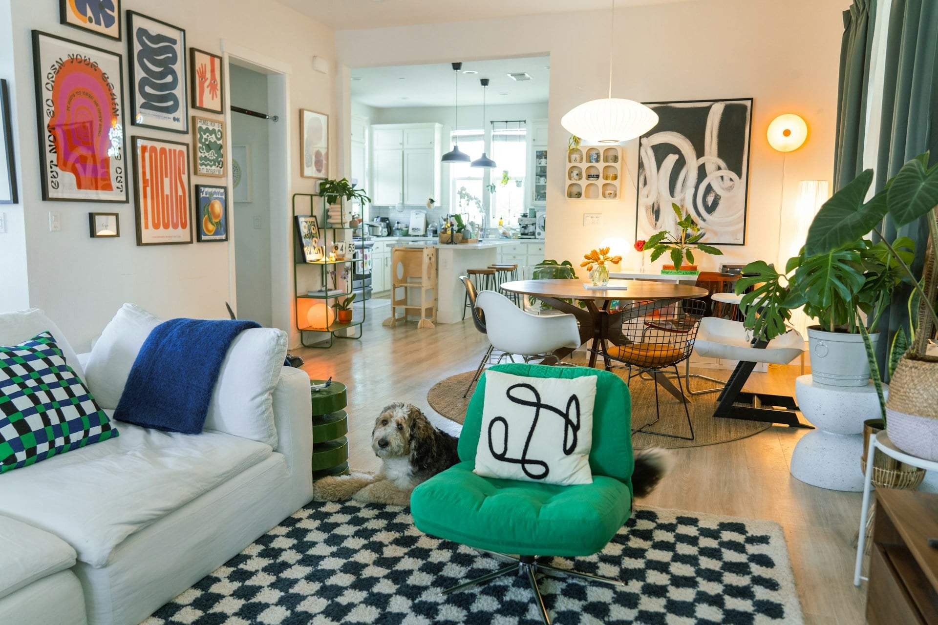
Earthy and Nature-Inspired Tones
Nature-inspired shades like olive, moss green, and camel brown will play a key role in 2026. These colors balance calmness with vibrancy. A wall or piece of furniture in these tones creates the feeling that nature has moved indoors. They pair wonderfully with light wood floors, cream textiles, and even matte black accents.
Warm Neutrals
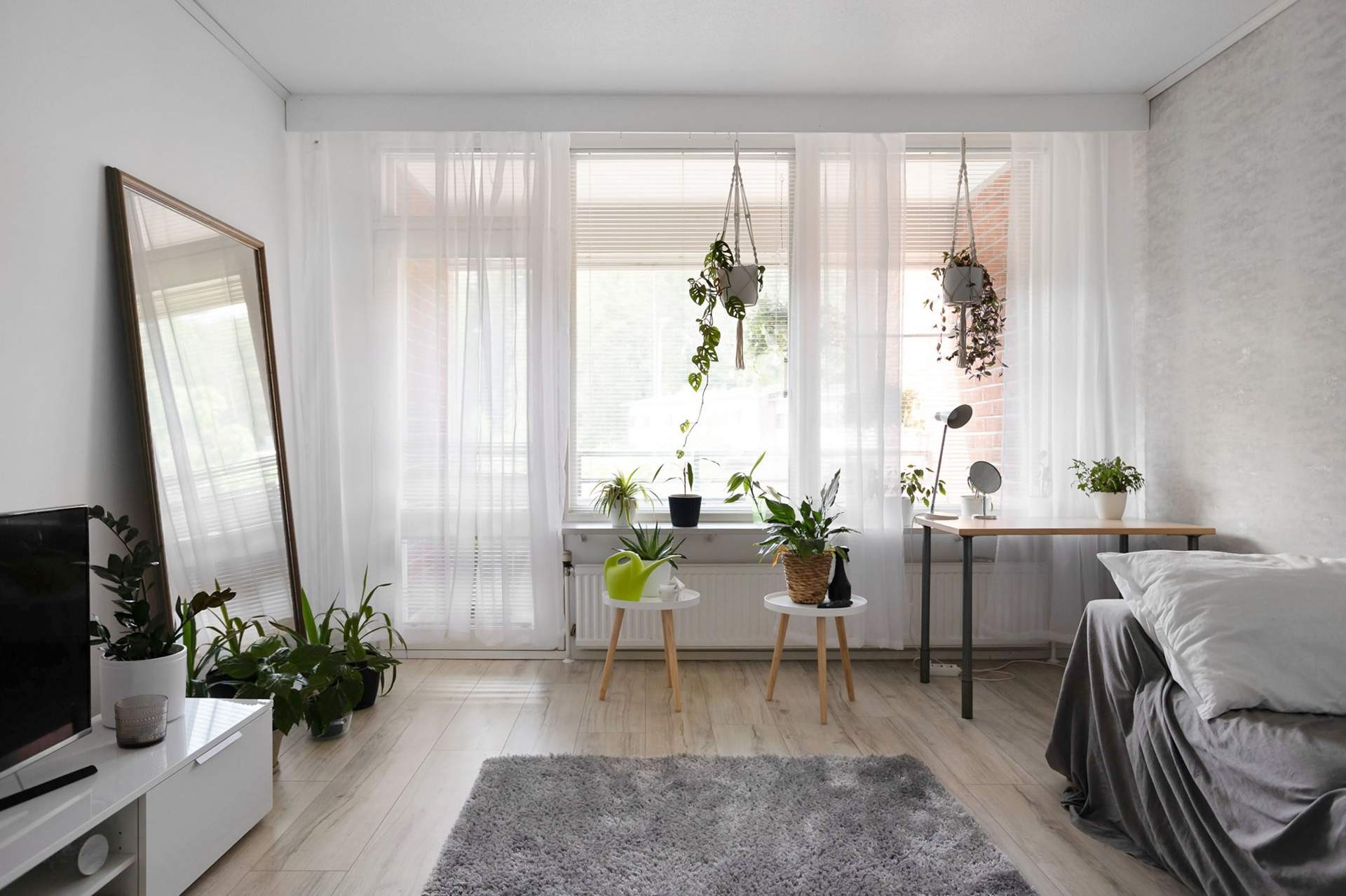
Neutral colors are getting a warm makeover. We’re moving away from cold grays and sterile whites toward cozier, more human tones. Think khaki, sand, and softer, warmer beiges. These shades create a subtle foundation that frames the space gently and serve as the perfect "canvas" for other colors and textures to shine.
Blue-Green Blends
For a fresh vibe, blue-green shades will be your go-to. Smoky jade and Capri blue bring the calm yet modern mood everyone will be after in 2026. This blend is both refreshing and soothing. Green adds a natural touch, while blue opens up the space. Pair with white, light wood textures, or natural fabrics.
Deep, Atmospheric Blues
Classic blues never go out of style, but they’re evolving. Expect deeper, warmer undertones and a more elegant finish. This color feels like a sophisticated evening gown—subtle but impactful.
Golden and Buttery Yellows
Yellow shades won’t disappear in 2026—they’ll just soften. Instead of bright lemon, expect buttery yellow and richer golden hues. These colors grab attention with warmth and cheer. Pair with cream, light wood, and avoid neon yellows.
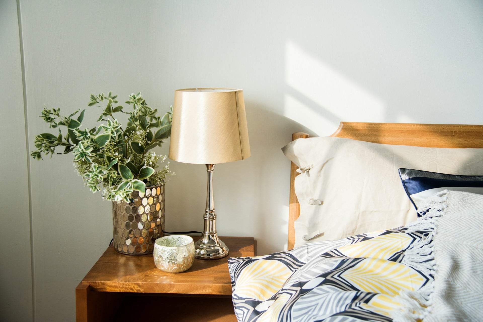
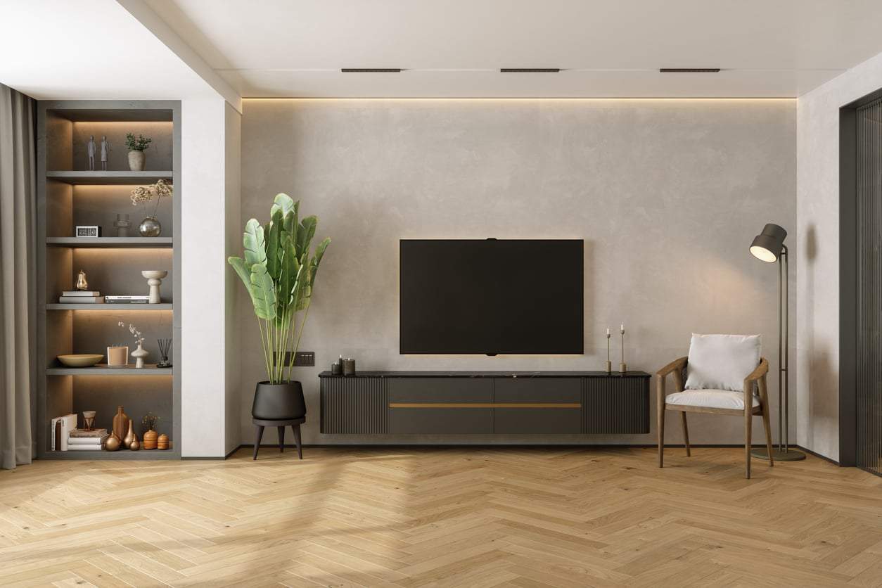
Chocolate and Caramel Browns
Brown tones won’t just be backgrounds next year—they’ll shine as bold accents. Expect chocolate, caramel, and chestnut shades. These colors radiate warmth, coziness, and timelessness—like a good book in a comfy armchair. Pair with light walls, gold or copper details, and natural textiles (wool, linen) to boost the warmth.
Powdery Pastels
Pastels aren’t disappearing—they’re evolving. Shades like soft mint, mauve, and powder blue will appear in gentler, more refined versions. These hues feel like a vintage watercolor—soft, sweet, yet elegant. Pair with wood elements, cream textiles, and a few deeper colors (like navy or brown).