A well-dressed couple walking into a restaurant in tonal white and cream has been doing the rounds online again this week, and the comments always split the same way: half admiring, half convinced the pair must have spent an hour negotiating in front of a mirror. Having styled a fair number of very ordinary couples for very ordinary occasions, I can tell you the ones who look effortless almost never plan the whole outfit together. They agree on one single element and then get dressed separately.
That's the entire method. Coordinating as a pair is not about symmetry, it's about a shared reference point — and the moment you try to match more than one thing, you tip from "together" into "costume".
Pick One Anchor, Never Three
Choose exactly one of the following to share: a colour family, a level of formality, or a fabric weight. One. If you both wear navy, let the shapes be completely different — his relaxed trousers and knit, your midi dress and flat sandal. If you agree on formality instead, you can wear entirely unrelated colours and still read as a set, because the pair of you are pitched at the same volume.
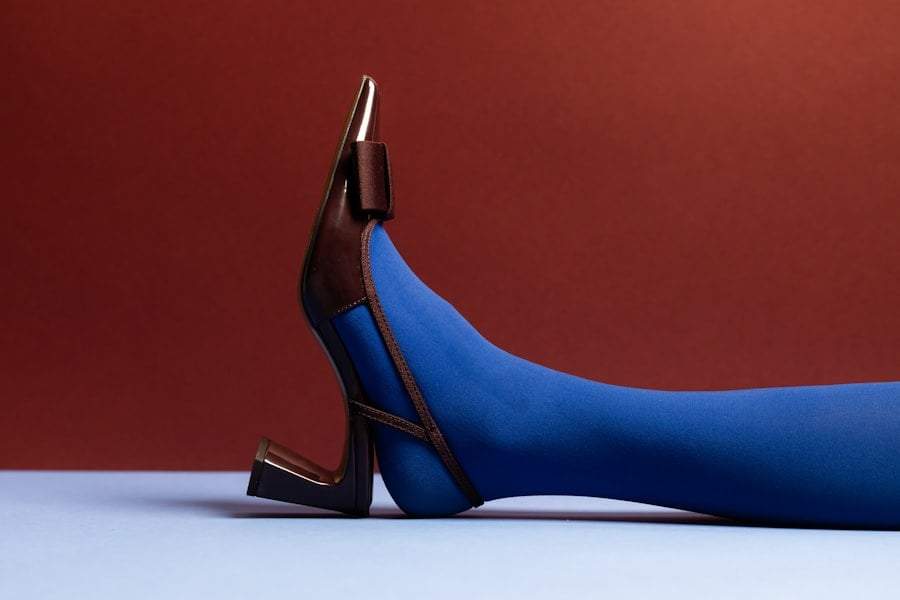
Formality is the anchor most couples get wrong and the one that matters most. Nothing looks more mismatched than one person in a tailored dress and heeled shoe standing next to someone in a hoodie and running trainers. Nobody notices whether your greens match. Everybody notices when one of you dressed for a wedding and the other for a car wash. Before you argue about colours, send each other a photo of your shoes. Shoes reveal the register of an outfit faster than anything else.
Tonal Beats Matching, Every Time
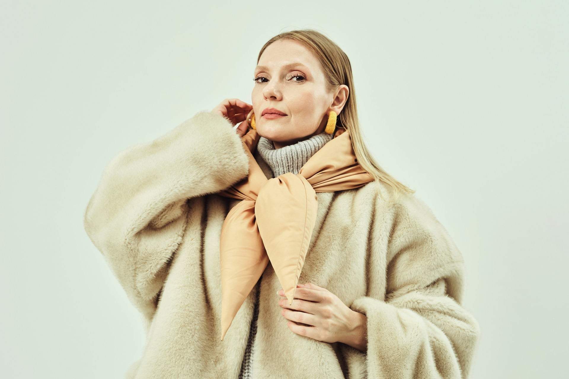
The couples who photograph well tend to wear neighbouring shades rather than identical ones: ivory next to oatmeal, charcoal next to slate, chocolate next to camel. Neighbouring shades give the eye somewhere to travel, whereas identical shades draw attention to the fact that you've coordinated at all — and once the viewer notices the effort, the magic is gone.
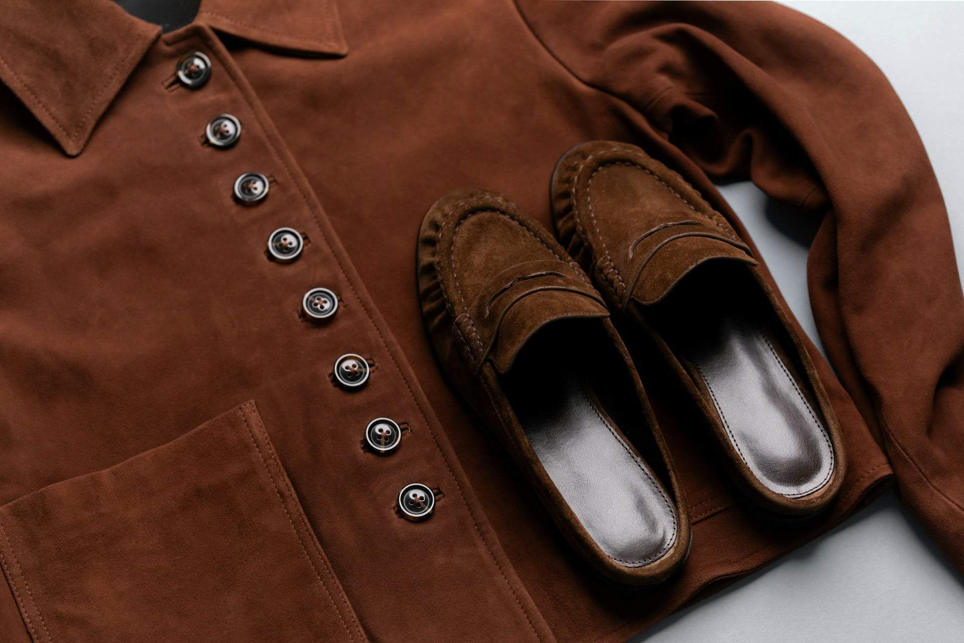
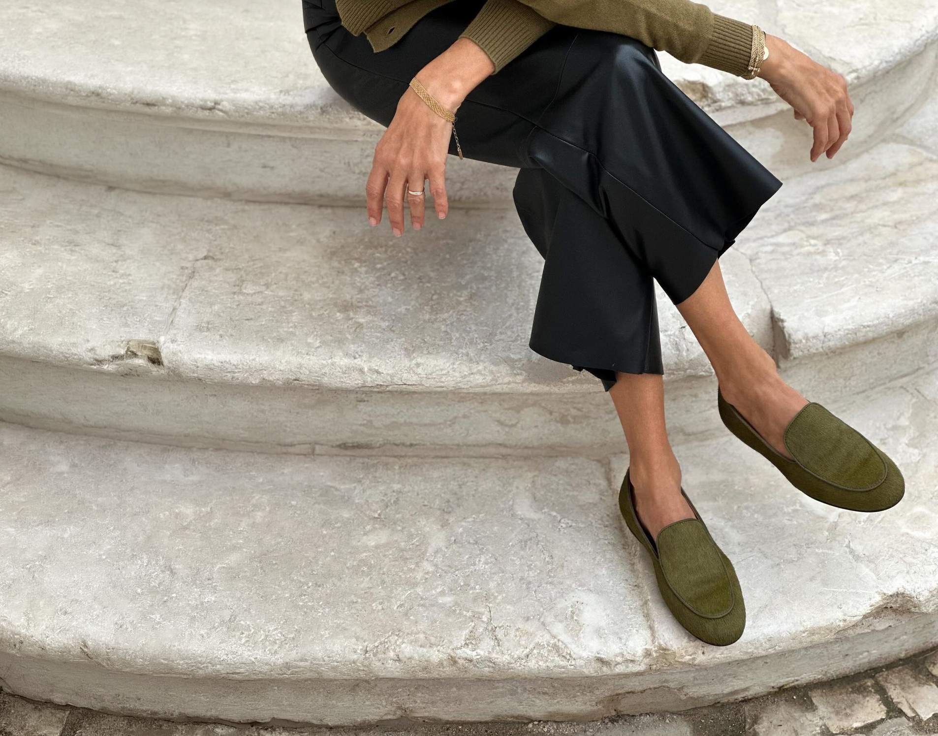
Texture does the same job with less risk. Two people in the same colour but different materials — linen against fine knit, silk against denim, wool against leather — look considered rather than uniform. This is also the most forgiving route in early autumn, when the temperature can't decide what it wants. One of you in a light knit and one in a shirt jacket still belongs to the same picture.
The Details That Actually Get Noticed
If you want a genuinely subtle link, put it in an accessory: the same metal in your jewellery, the same leather tone in bag and belt, a scarf that borrows one colour from the other person's shirt. These are quiet, and quiet is what reads as taste. Loud coordination — matching prints, matching slogan pieces, matching hats — has exactly one appropriate context, and that's a party with a theme.
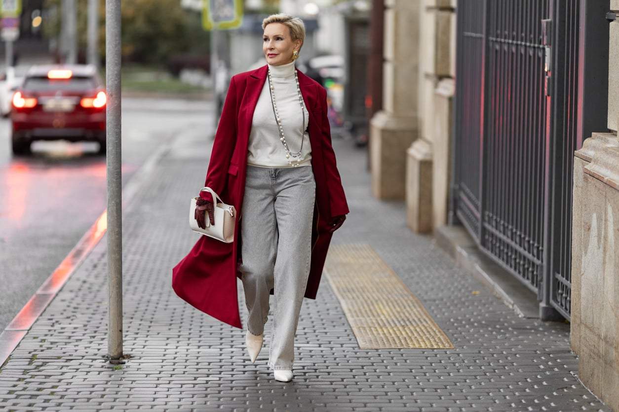
One more thing worth checking before you leave: proportion between the two of you. If you're wearing something long and fluid, an overly cropped or fussy outfit beside you will look restless. Long next to long, or long next to clean and simple, always works. It's the reason a slip dress and a plain shirt with well-cut trousers is an unbeatable pairing, in any budget bracket, in any city.
What If My Partner Has No Interest in Coordinating?
Then don't make it a project — make it one text. Ask for a single piece of information: "Are you wearing trainers or proper shoes tonight?" That tells you the formality level, and you can build your own outfit to sit alongside it without asking anyone to change. Most reluctance comes from a fear of being styled, not from a fear of looking good together.
Do We Have to Match Colours to Look Like We Belong Together?
No, and it's often the weakest link you can choose. A shared level of polish, a shared fabric weight for the season, or one repeated accessory metal will read as harmony far more convincingly than two people in the same blue. Think of it as playing in the same key rather than singing the same note — the effect is unity, but nobody can point to the reason.