Few trends spark as much attention in home decor as wall paint. That’s probably because it’s easy to access—almost anyone can refresh their space with a new coat (unless your lease says otherwise). Plus, it’s a budget-friendly, simple way to breathe new life into your rooms. Simply put, it’s a change we can all be part of. That’s why every year, major paint brands reveal their “color of the year” collections, predicting the shades that will dominate. Some years, these predictions hit the mark perfectly—2026’s calm, natural tones are just that. Let’s see which hues will lead the way in the coming year.
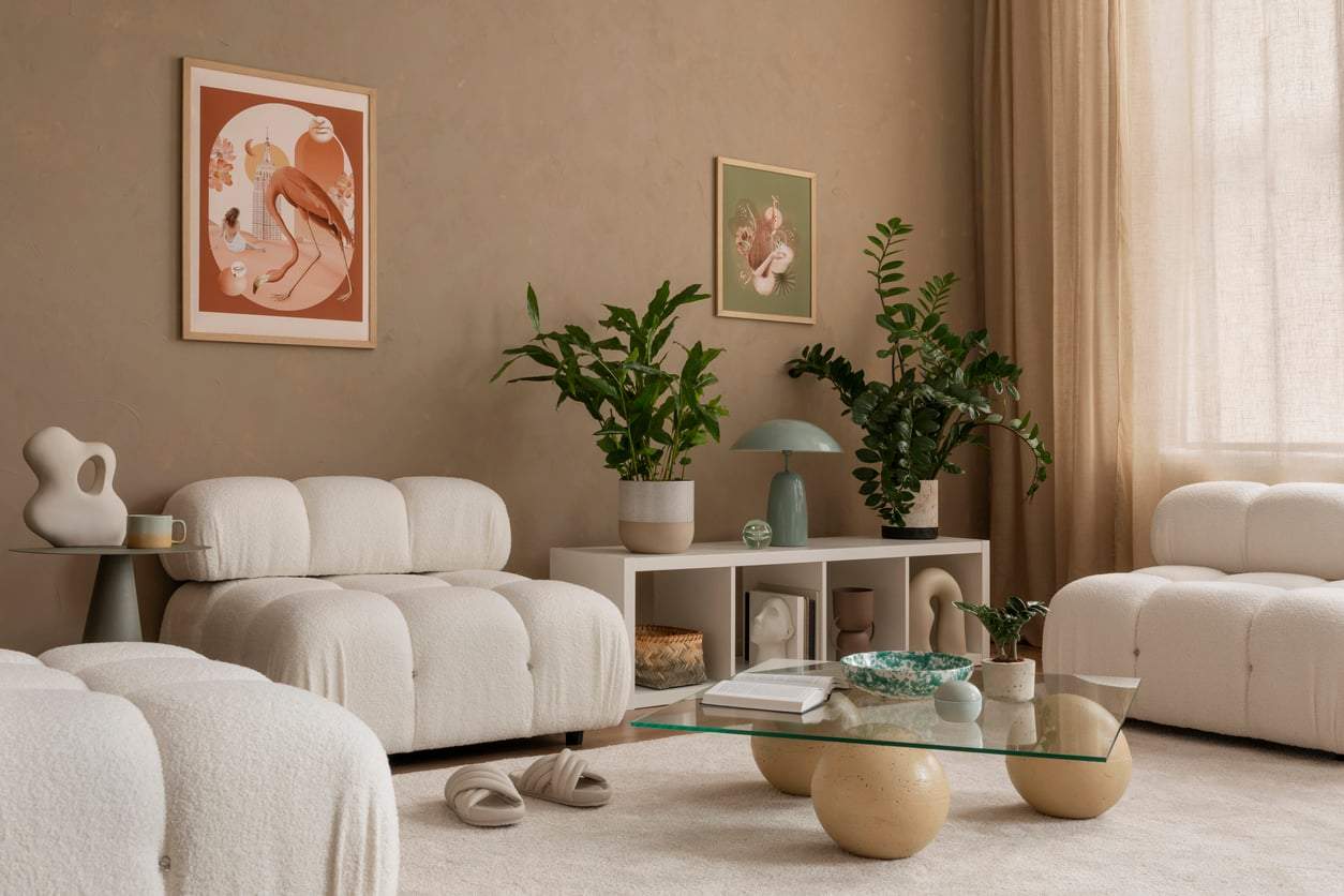
Taupe
Taupe is that timeless neutral that never goes out of style. The grayish-brown tone feels both warm and understated, making it a perfect base for any interior. Designers say this color helps create the pleasant, calming atmosphere we all crave at home. It works beautifully on walls, fabrics, or furniture and pairs effortlessly with any color palette.
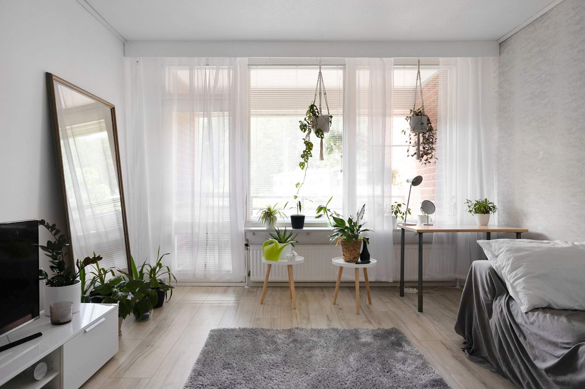
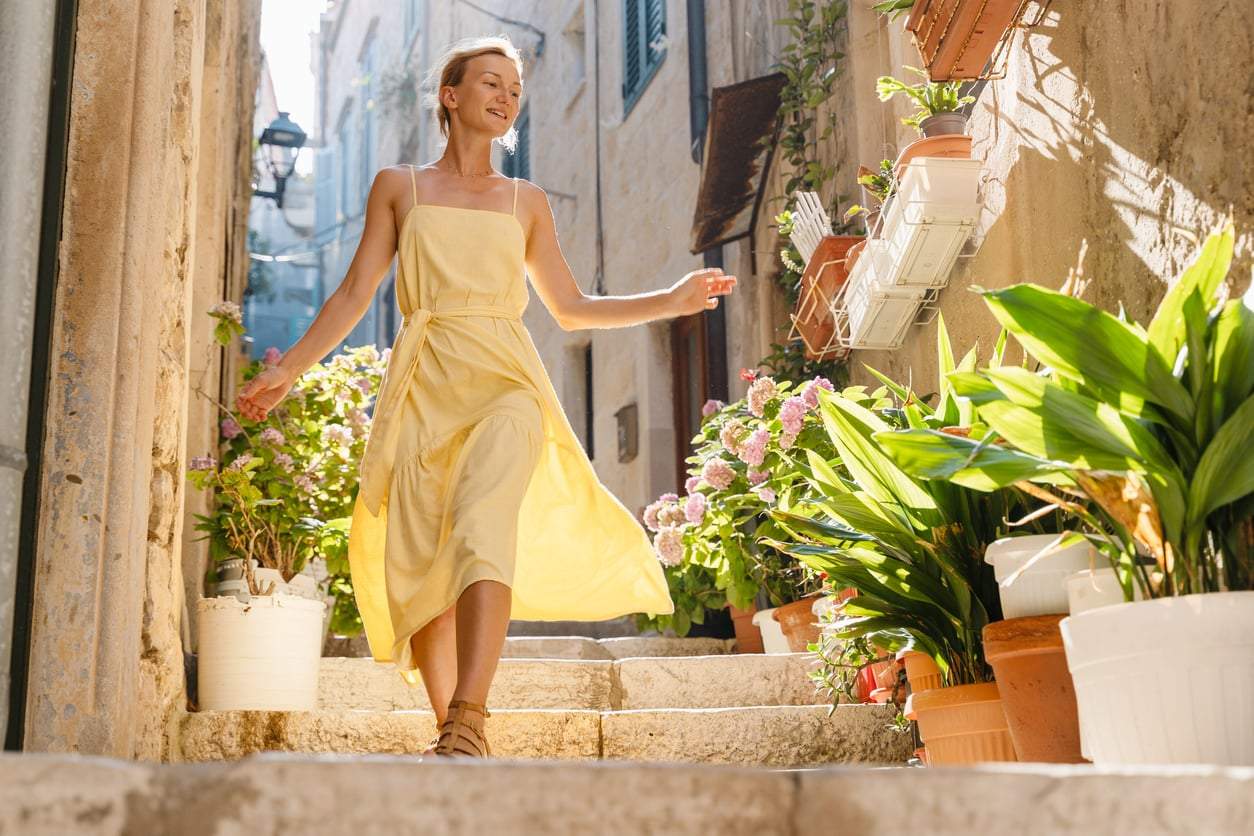
Sand
Sand is one of nature’s softest shades. Its gentle, light tones fill spaces with sunshine and radiate warmth and friendliness. It’s ideal for living rooms or home offices where peace and harmony are the goals. Sand pairs especially well with wood and rattan furniture and delicate textures.
Mushroom
Mushroom strikes the perfect balance between gray and brown, bringing natural elegance to any space. Designers consider it one of the most timeless shades because it works well in styles from Scandinavian to Mediterranean. Mushroom-toned walls and textiles evoke a close connection to nature while radiating calm.
Creamy White
The creamy white tone is a softer, cozier take on classic white. It’s subtle yet brightens and freshens any space. Designers now favor this “non-sterile” white because it adds warmth even to minimalist rooms. Against creamy white walls, textures like linen, wool, or natural wood truly come alive.
Khaki Green
One of 2026’s biggest comebacks is khaki green, hailed by designers as the new neutral foundation. It’s softer and friendlier than stark white, yet elegant and timeless. It’s the perfect backdrop that lets materials and textures shine. Many find this shade calming, natural, and refined.
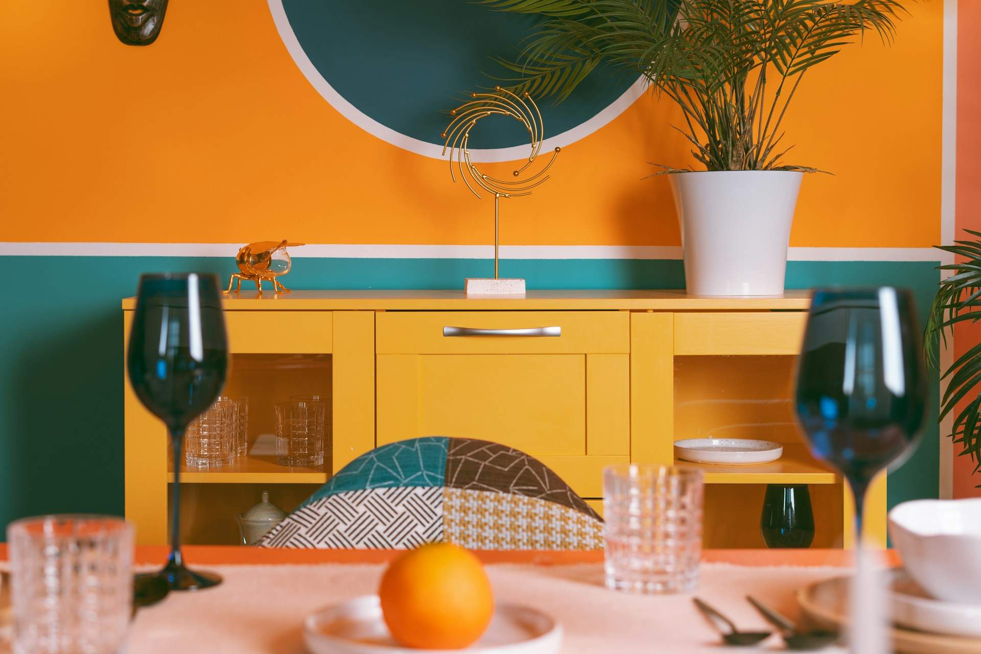
Ochre
Rich, golden ochre radiates energy and warmth while keeping its natural vibe. More designers are using it in kitchens, entryways, and offices to create lively yet grounded atmospheres. Ochre pairs beautifully with deep greens or terracotta for a Mediterranean feel.
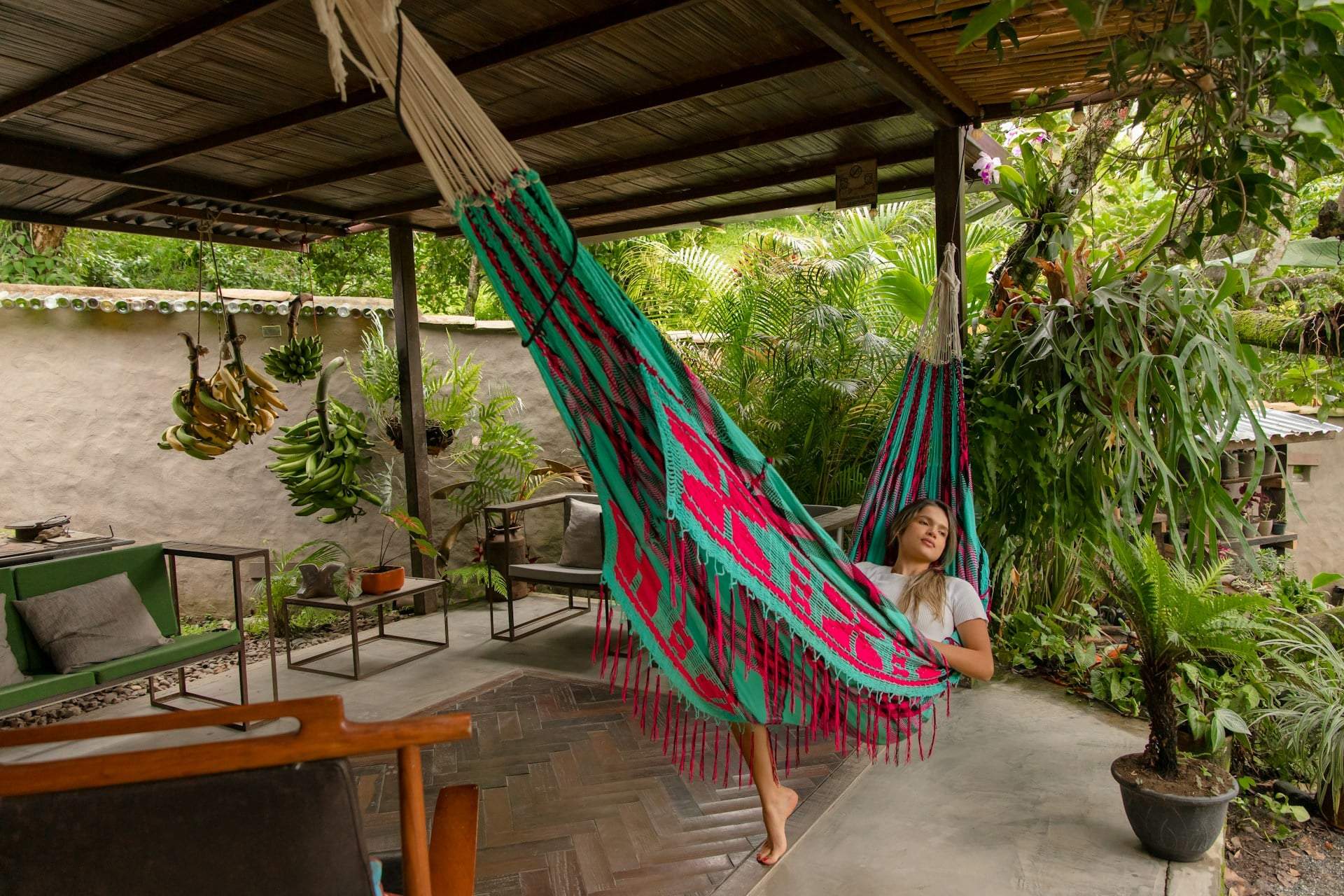
Forest Green
Forest green brings the depth of nature indoors. It’s calming, elegant, and truly on-trend, making it a cornerstone of the “back to nature” style. Designers recommend it for bedrooms, living rooms, or reading nooks because it supports focus and inner peace. It stands out especially with wood, copper, or linen materials.