A color palette is simply a curated group of colors you use together in a space. Its biggest perk? It instantly creates a sense of unity and harmony, making decorating a breeze. And it’s not just about the actual decorating — it helps with planning and shopping too. You won’t waste hours staring at decorations that clearly clash with your style. Finding and creating your palette is like getting advice from a color expert: you’ll know exactly what to choose, saving time and money.
To nail your color palette, focus on these points:
- Colors that create harmony,
- Match well with your existing shades,
- Make decorating simpler and quicker,
- Deliver a cohesive look at first glance.
A solid palette usually has 3-6 colors. You can go smaller if you prefer a minimalist vibe, but more than that often feels cluttered.
Create your perfect Christmas color palette
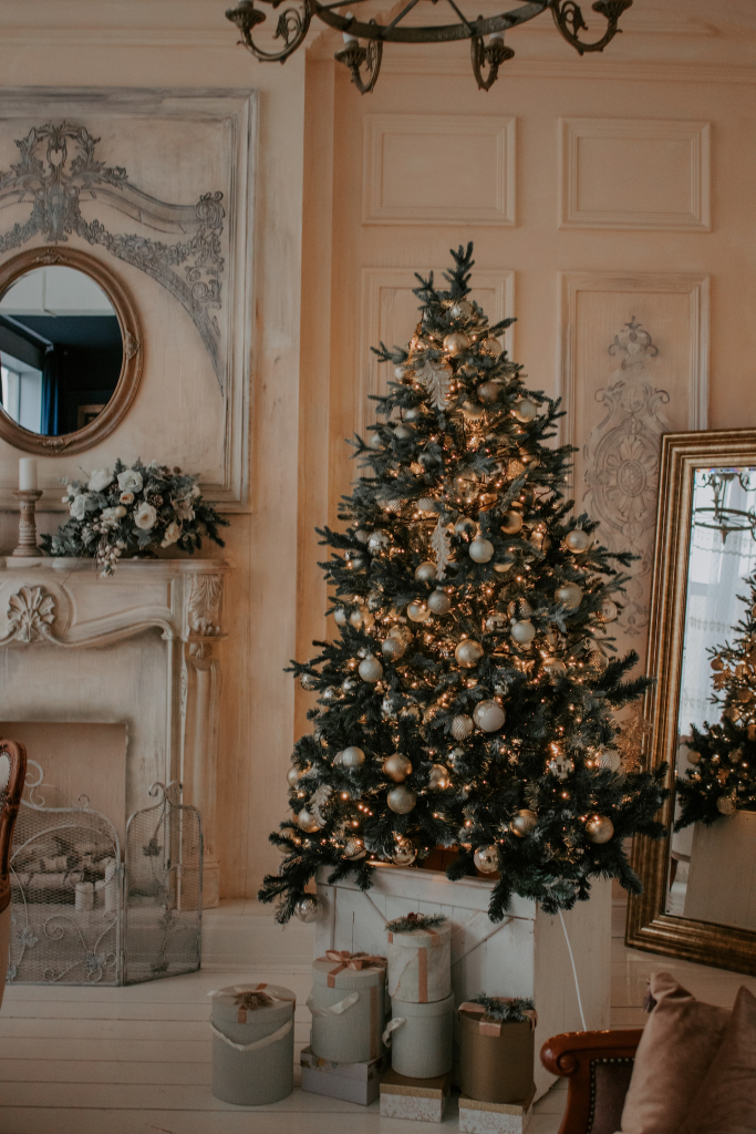
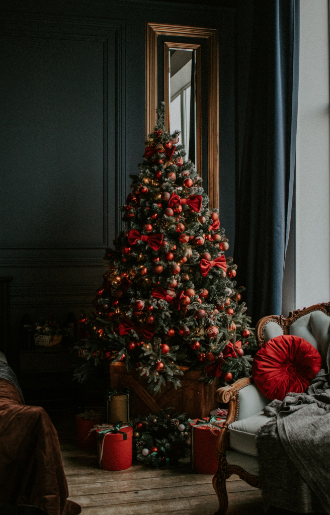
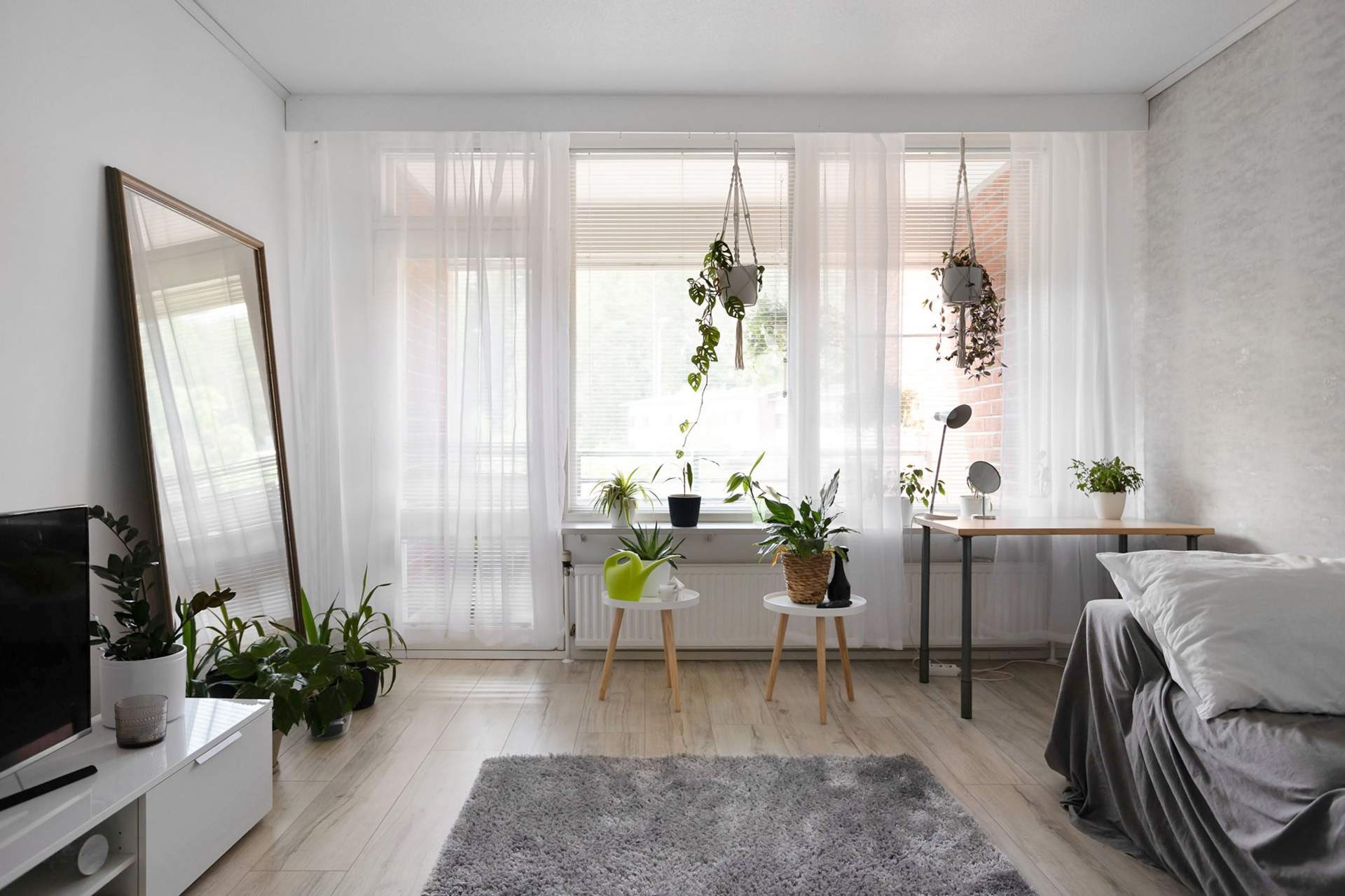
Just like in interior design, your holiday palette should start with neutral, simple, and clean colors. Light base colors, maybe with a bit of sparkle, work great to open up the space and keep decorations feeling airy. That said, dark gray or black furniture and accents have become trendy lately, and they pair beautifully with gold or silver decorations. Still, most homes lean toward lighter shades, so always consider your space’s natural features first.
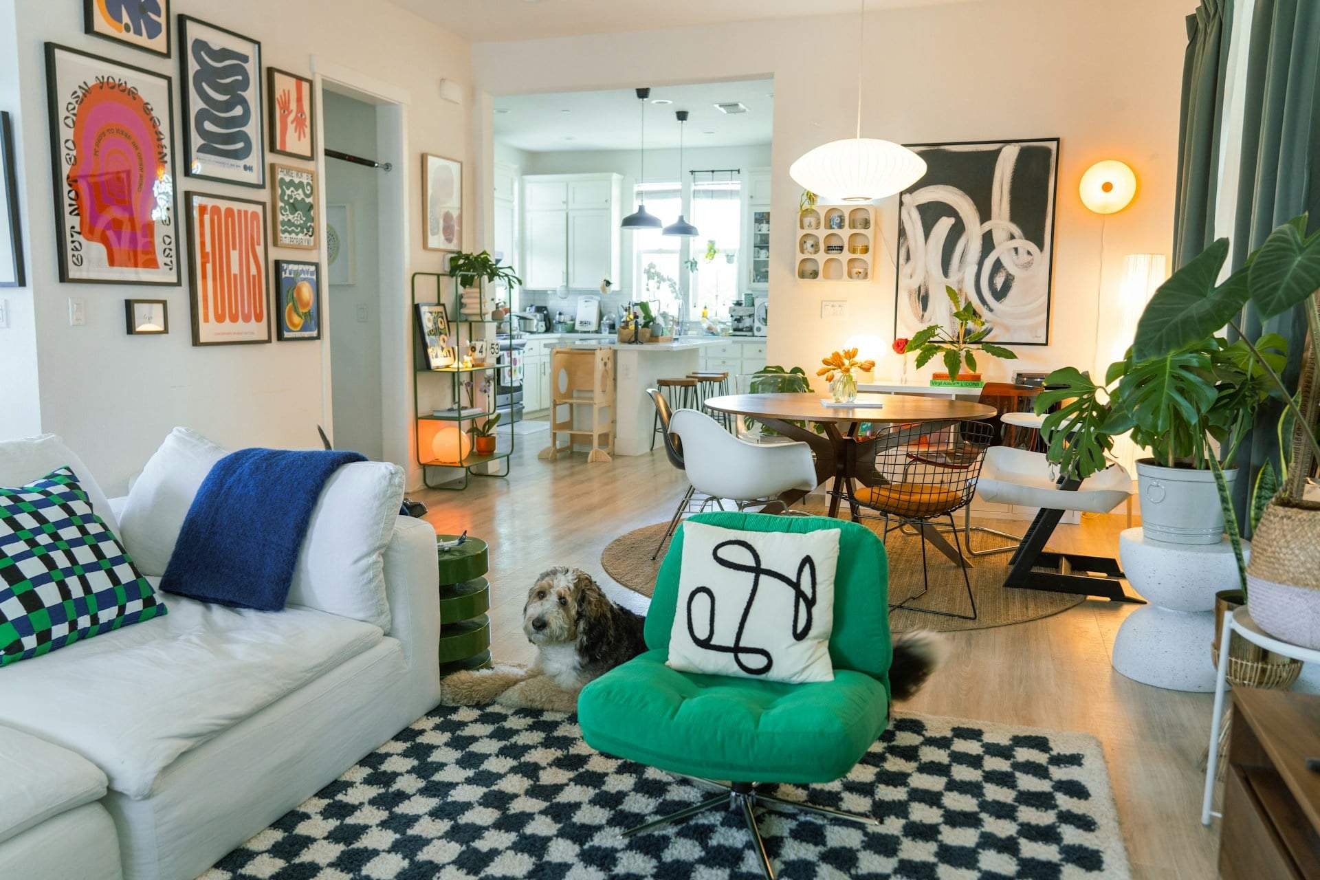
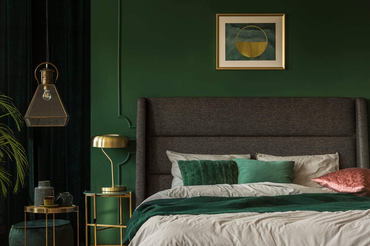
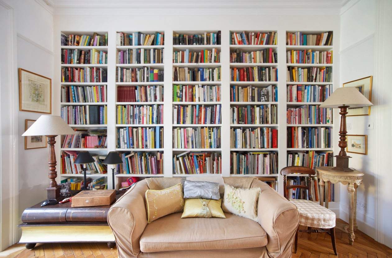
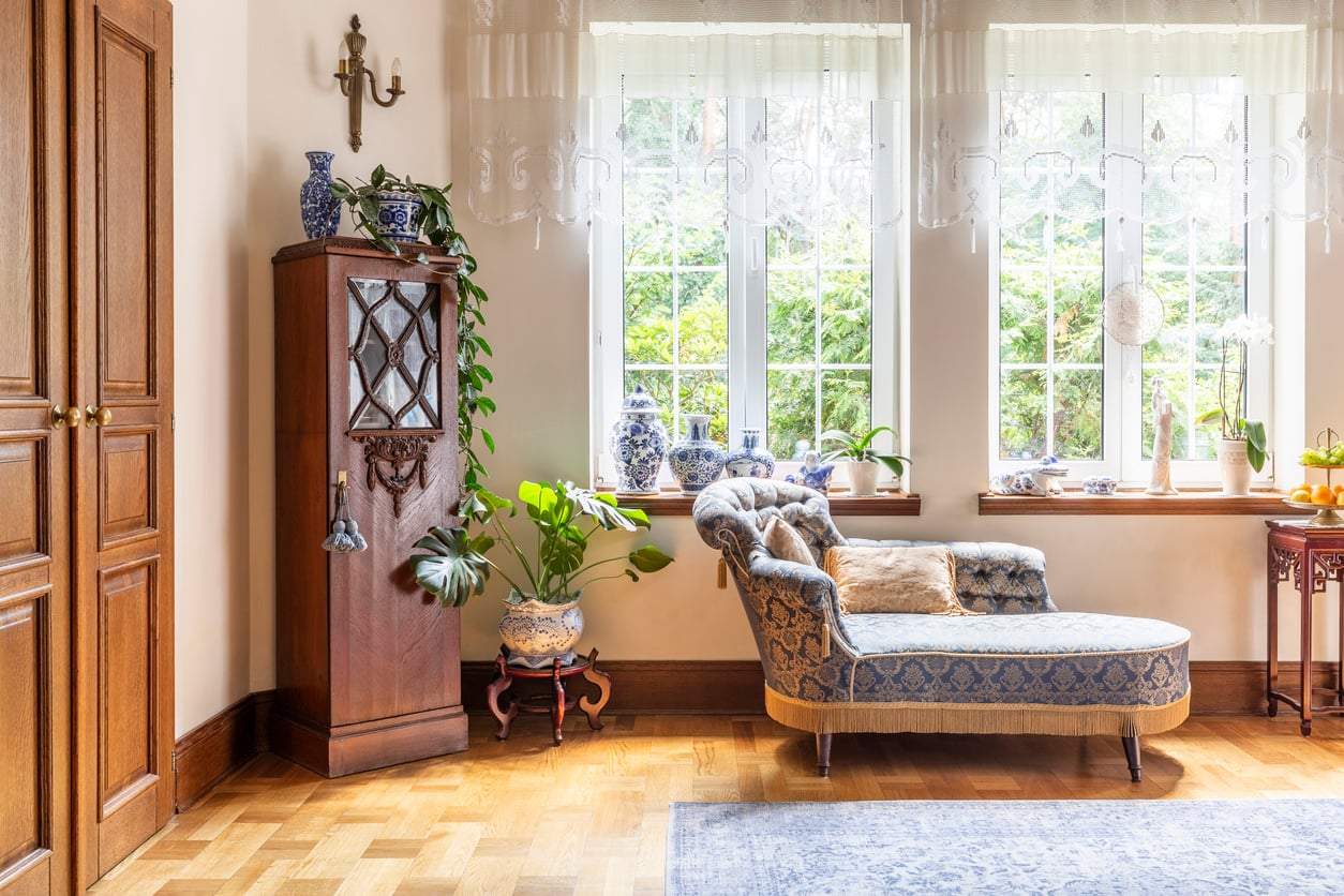
There are many Christmas colors to choose from, but the key is to work with what you have. Your holiday decor should complement and harmonize with the colors already in your home. Focus on this, and you’ll bring balance and a thoughtful touch to your festive look without overcrowding.

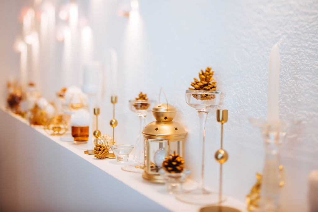
Choose just one metallic shine
If you’ve used lots of gray or neutral tones, adding 2-3 extra shades will look great. But if you want an instant festive boost, pick silver glitter as one of your colors! It will feel like it’s always belonged in your decor and instantly lifts the mood.
A simple, neutral base (regardless of color) pairs wonderfully with shiny decorations. These colors are winter classics that remind us of snowy landscapes. Speaking of metals: pick one and stick with it! Whether it’s silver, gold, rose gold, or bronze, this dominant color and material should be counted in your palette.
Black and white technically don’t count toward the recommended 3-5 colors—unless you have a lot of black in the room. In that case, consider it a key color since it will strongly influence the final look.
How to find your own Christmas colors
Beyond neutrals and metals, the next step is discovering your personal palette.
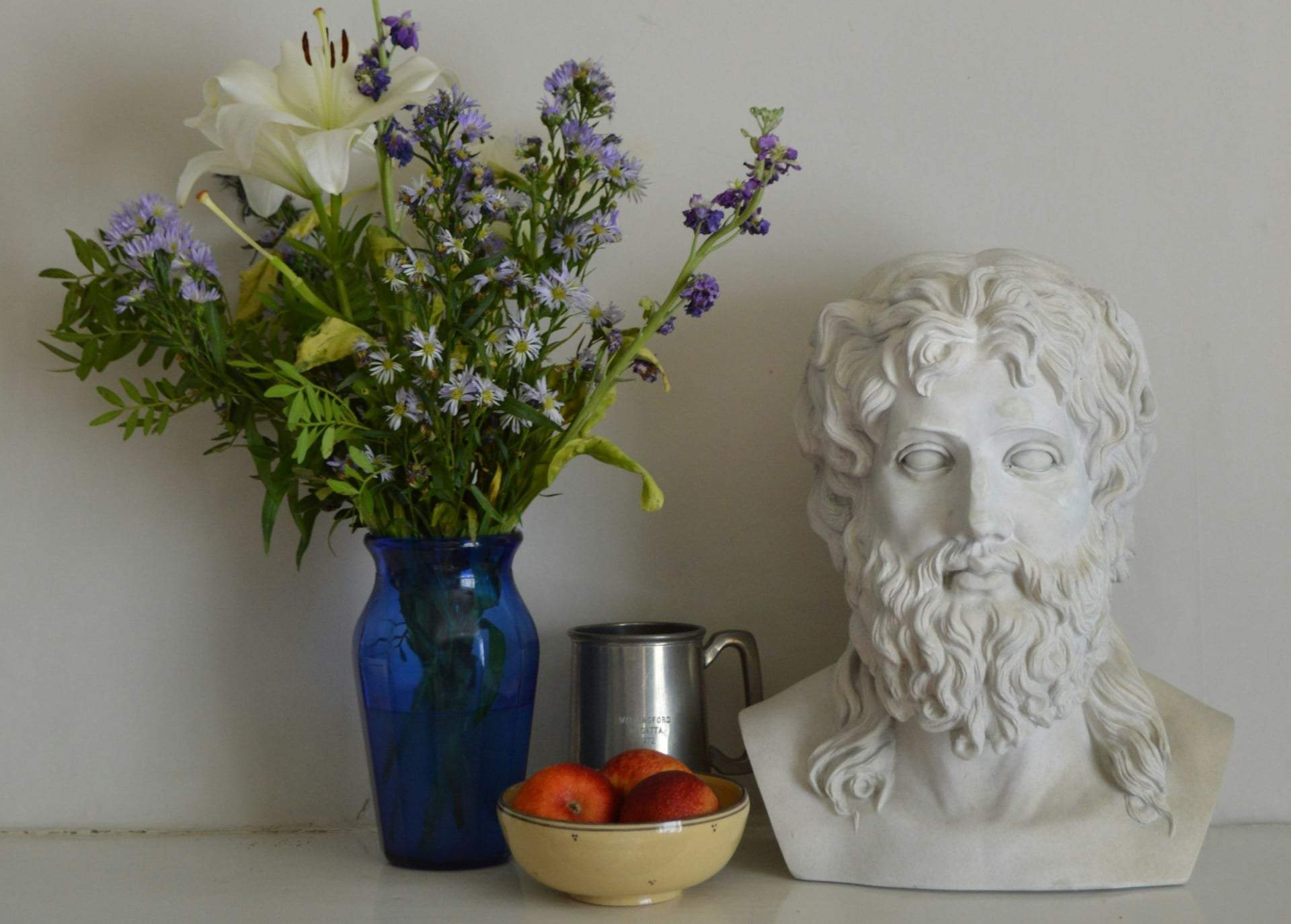
If you find a photo that truly inspires you, take a close look at the dominant colors. It doesn’t have to be a Christmas photo—the magic is in how the shades work together. You can help yourself by extracting the main colors using any simple photo editor or Canva.
- Create 3-5 color swatches next to the image, then select the eyedropper tool to pick colors.
- Hover over a key color in the photo and fill a swatch with that shade.
- Repeat to gather the main colors and build your own personalized Christmas palette.
Pair your new Christmas colors with your existing base and metals to see if they harmonize. If they do, you’re ready to start decorating!