Let old furniture do the contrast work
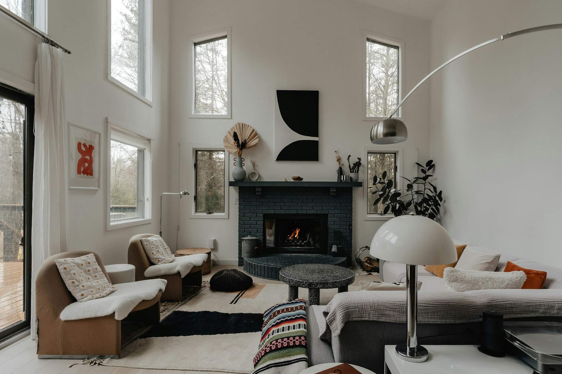
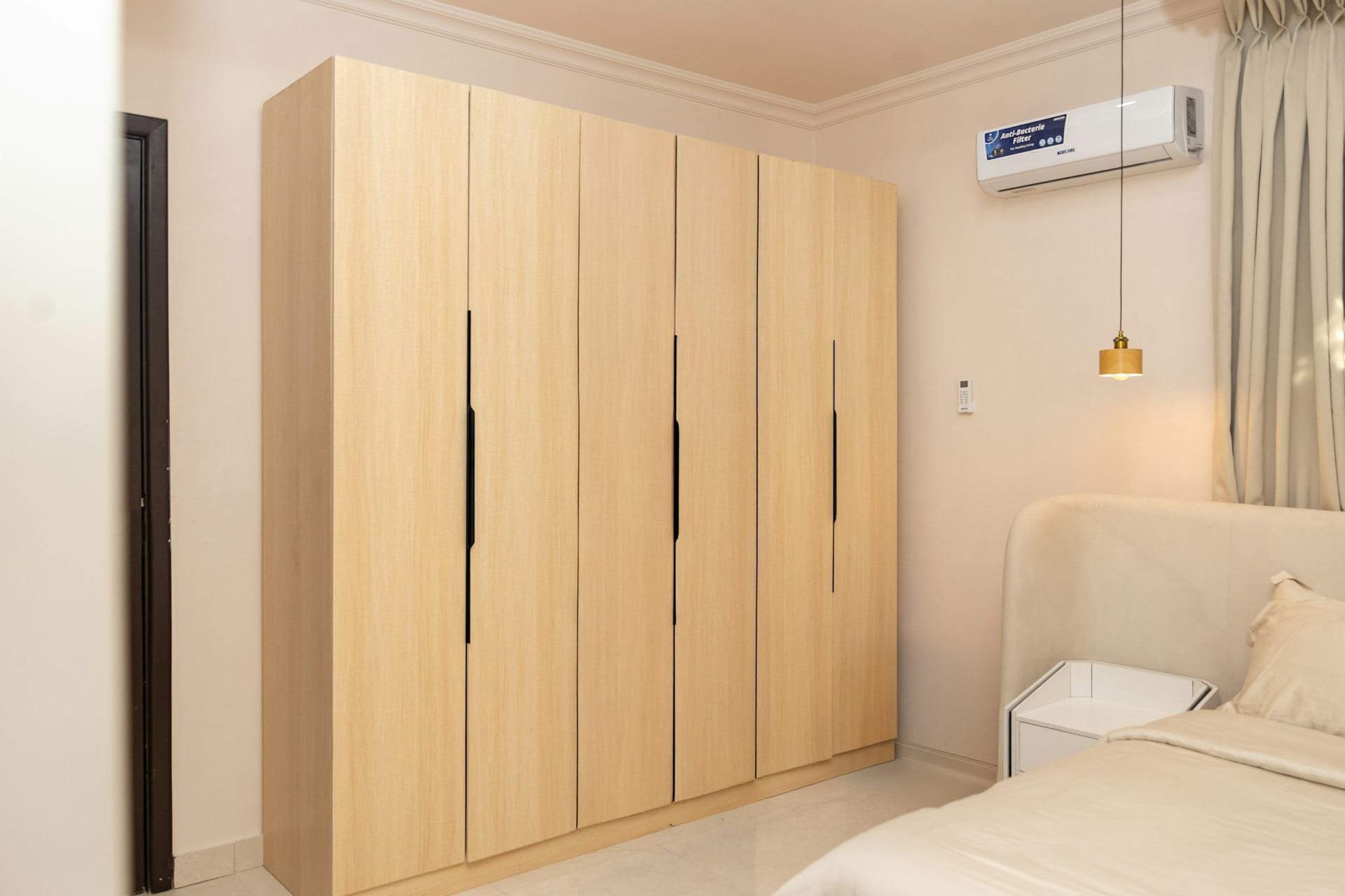
Dark walls are the best backdrop vintage furniture ever gets. Warm woods — oak, walnut, anything with a bit of honey in it — glow against deep colour in a way they never do against white. This is where charity shops, auction sites and your grandmother's sideboard become genuinely useful rather than merely sentimental.
You need contrast somewhere, though, or the room goes heavy. Bring it in with the things you'd touch: a cream wool throw, unbleached linen curtains, a pale rug, brass or aged metal, the paper of books on open shelves. Plants read extremely well against dark walls because the green reads as colour rather than as more foliage. And hang art in pale mounts — the frame edge does the same lifting job a white skirting board would, but in a place you've chosen.
Will dark walls make my north-facing room feel cold?
Not if you choose the right dark. North light is cool and slightly blue, which pushes greys and cold blue-greens towards flat and chilly. Deep colours with warmth underneath — forest greens with yellow in them, browny-reds, inky blues with a hint of violet, true chocolate — hold up much better.
Test properly rather than guessing. Paint a large piece of paper rather than the wall, move it to different corners, and crucially look at it at nine in the morning, three in the afternoon and under your actual lamps at eight at night. A colour that works in all three is a keeper.
Can I do this in a rented flat?
Often yes, but ask first, and ask specifically — some landlords are fine with colour if you agree to return it to neutral, and it's worth getting that in writing. Dark colours do take more coats to cover later, so factor that into what you're promising.
If painting is off the table, you can get a lot of the effect with soft furnishings and lighting alone. Heavy curtains in a deep shade, a dark rug, a tall bookcase and a few warm lamps will transform how a pale room feels after dark — and all of it moves with you.