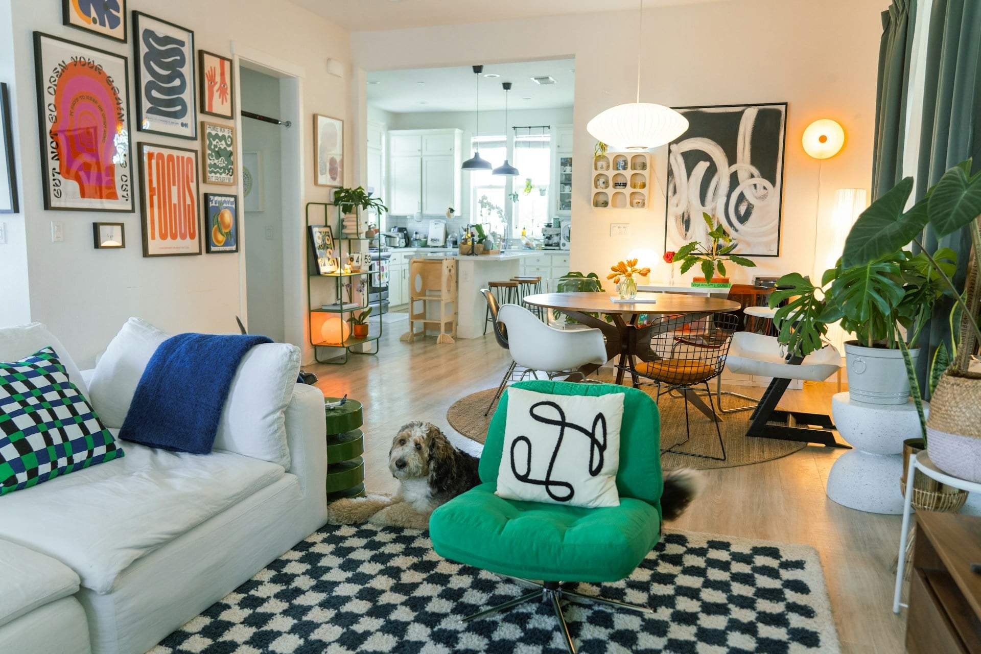
We all know how colors strongly affect us. A clear blue sky can instantly lift your spirits, a boldly colorful outfit can make you smile, and even wearing a bright shade yourself can brighten your day. Colors create mood—and this is especially true for the kitchen.
For years, interior design trends revolved around gray, beige, and muted tones. They were safe and elegant, but let’s be honest: a bit dull. Now, a refreshing shift is underway. More people are choosing kitchen colors that simply bring joy—pinks, greens, yellows, blues. It makes total sense: the kitchen is one of the most used spaces at home, so its colors influence us daily. If you want your kitchen to be not just beautiful but genuinely uplifting, these shades are especially inspiring right now.
Warm Reds
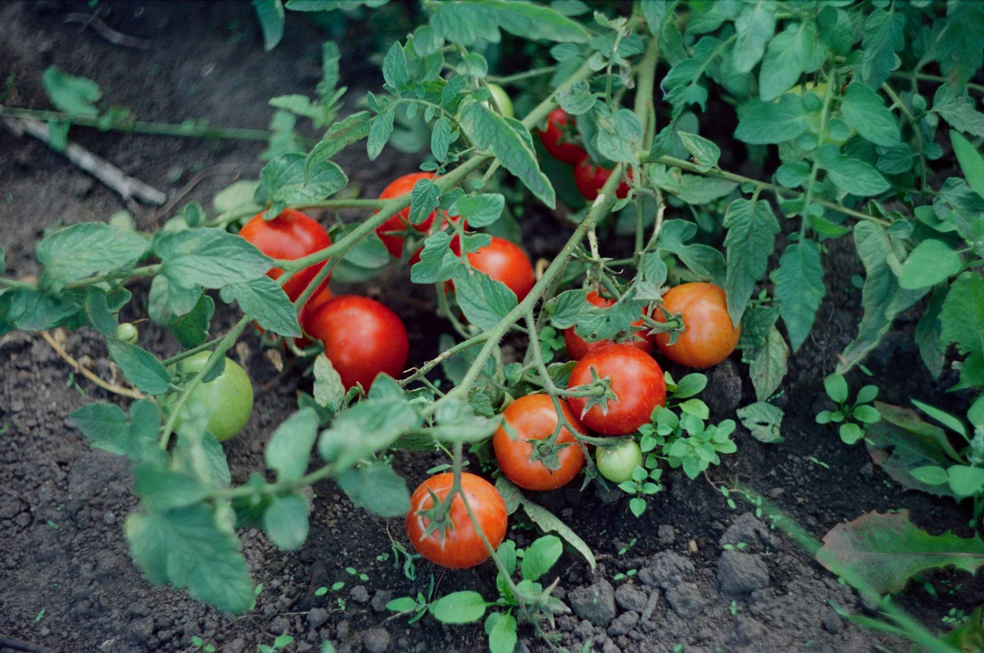
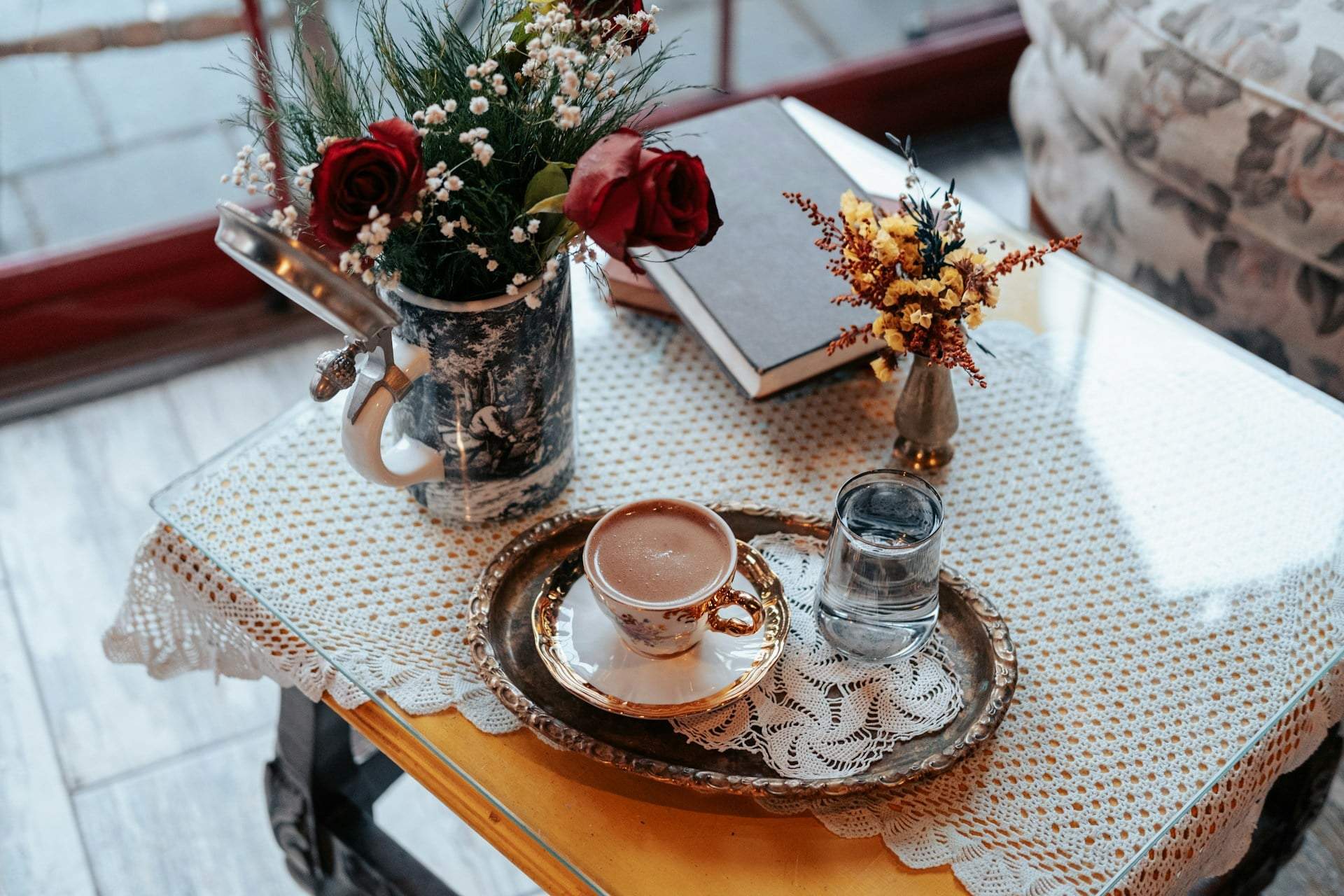
Red was long considered off-limits in kitchens—too strong, too much, too dominant. But in the right shade and balance, it’s vibrant and energizing. Warm, earthy reds—terracotta, rust, sienna, coral—add a rich, cozy vibe without feeling heavy. Use them sparingly on accessories, rugs, ceramics, or boldly on cabinetry. The secret is balance: paired with light walls and natural materials, red becomes striking, not overwhelming.
Soft Pink
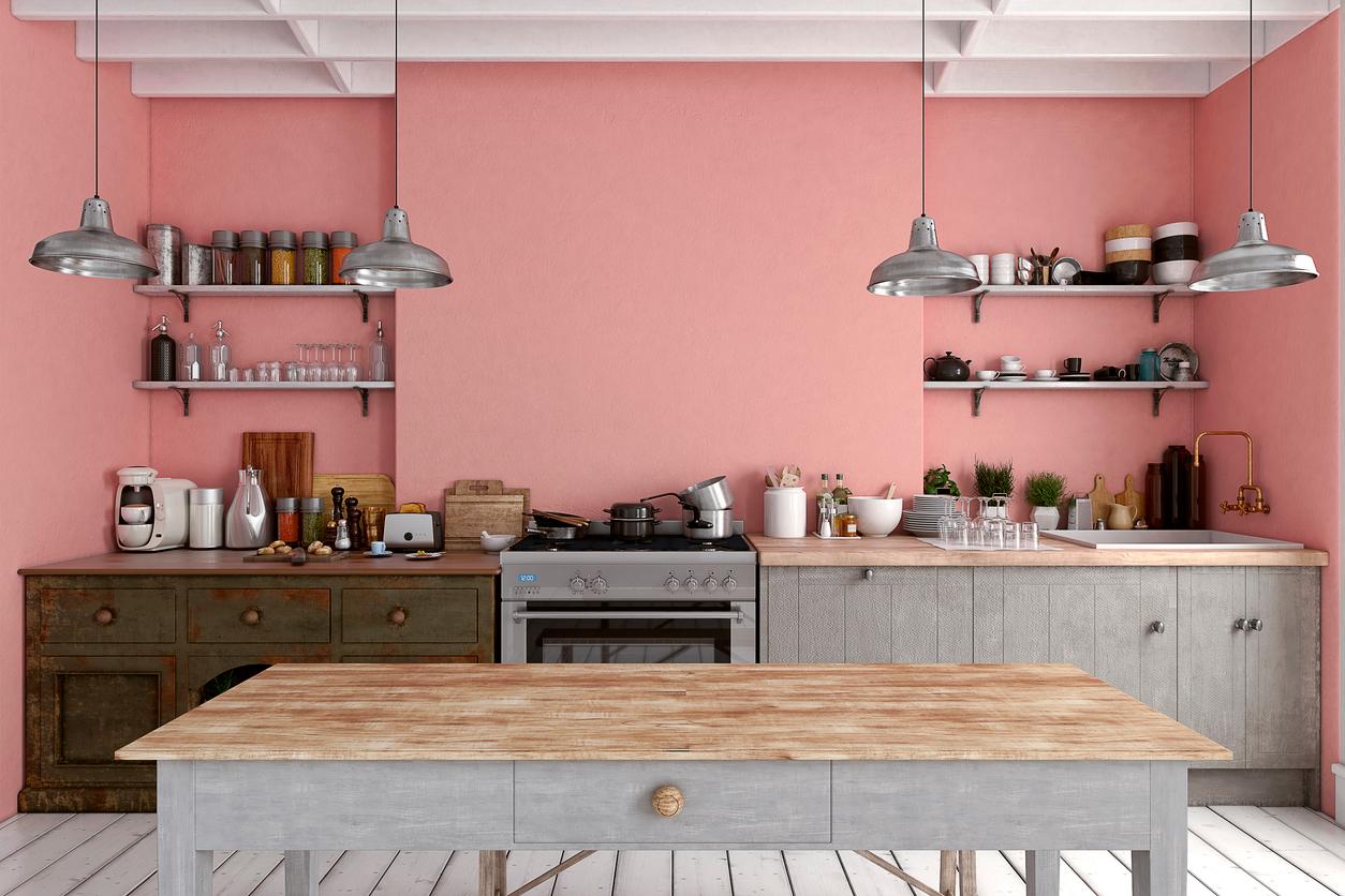
A pink kitchen is a true mood lifter. Warm, playful, yet surprisingly timeless. No longer just a fleeting trend, soft, plaster-like powder pinks have become classics. These shades aren’t sugary—they’re elegant and pair beautifully with darker accents like graphite gray or black. A favorite of dopamine decor, pink instantly lifts your spirits while creating a friendly, social vibe.
Butter Yellow
Yellow is one of the strongest mood boosters—it’s no wonder we associate it with sunshine. Butter yellow is a particularly lovely choice: warm, cheerful, and never overpowering. It works especially well in kitchens with limited natural light, where it literally brightens the space. Nature-inspired yellows—butter, honey, mustard—are both energizing and calming. Balanced with darker countertops or metallic accents, they create a truly stylish look.
Olive and Sage Green
Green has long been the color of calm and renewal, and it brings exactly that to the kitchen. After bright, acidic greens, earthy tones are back: olive, sage, moss green. Lighter sage shades almost act as neutrals, while deeper olives add warmth and depth. They shine paired with natural materials like wood floors, stone, and ceramics. A green kitchen feels fresh, soothing, and timeless.
Sky Blue
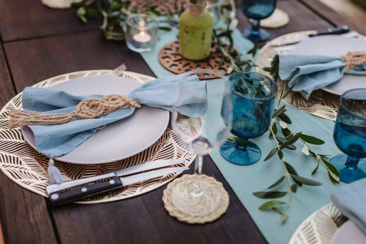
Stepping into a light blue kitchen feels like a breath of fresh air. Blue connects us to sky and water, so it has an instinctively calming effect. Pale sky blues work best—they make the space feel light and airy. If you worry about it feeling too cool, balance it with warm neutrals, cream tones, or copper and gold accents. The result is fresh yet cozy.
Orange
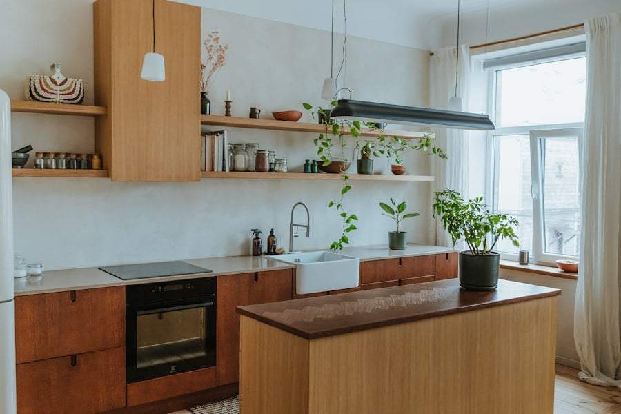
Burnt orange is one of the most exciting kitchen colors for 2026. Warm, bold, yet surprisingly refined. Its reddish-brown tones energize while feeling friendly and inviting. If a full orange kitchen feels too much, try a standout feature—a kitchen island, open shelves, or a single wall. This color is both cheerful and elegant—a true “heart of the home” vibe.
Warm Neutrals
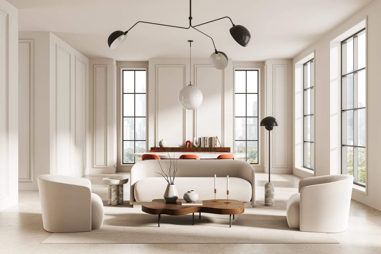
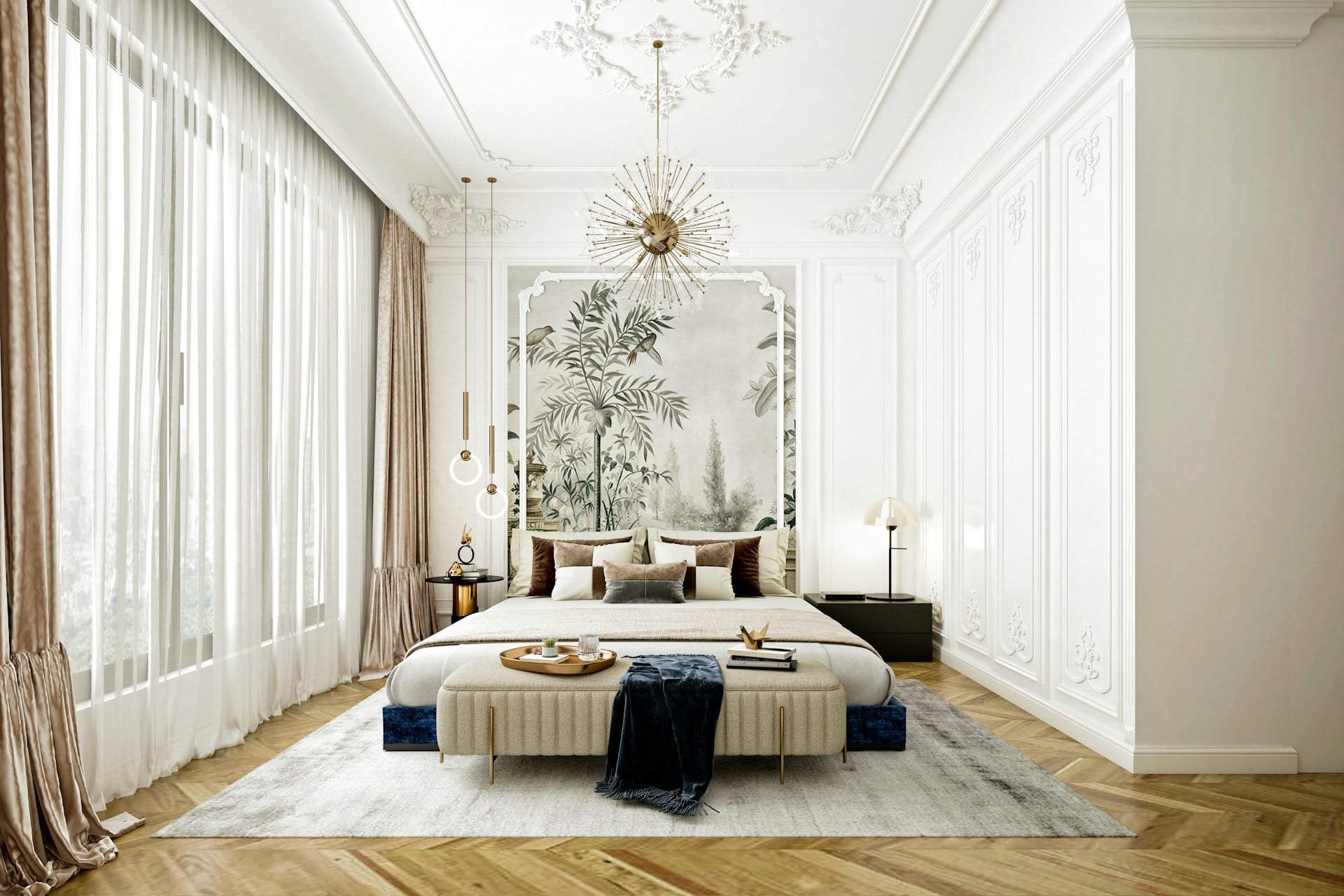
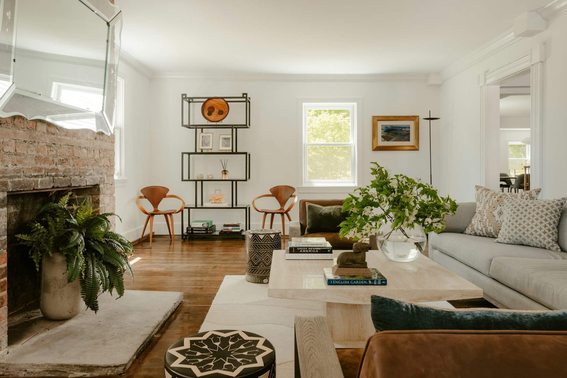
Warm neutrals—like mushroom gray, taupe, oat, clay, beige—quietly but confidently dominate modern kitchens. These shades capture the essence of understated luxury and warm minimalism. They’re not loud but rich, offering a perfect base for textures, natural materials, and small colorful accents. If you love clean, timeless spaces without a cold feel, this palette is ideal.
The secret to a happy kitchen is simple: choose colors that make you feel good. Whether it’s bold red, sunny yellow, soothing green, or classic warm beige, colors shape not just your kitchen’s look but your daily mood.