Have you ever thought that your home’s color palette might reveal more about you than just your style? Colors have a deep psychological impact—they shape our mood, emotions, and even energy levels. Some shades energize and motivate, while others bring calm and peace. Before renovating or decorating a new home, consider the vibe you want each room to create.
The Dynamic Power of Warm Colors
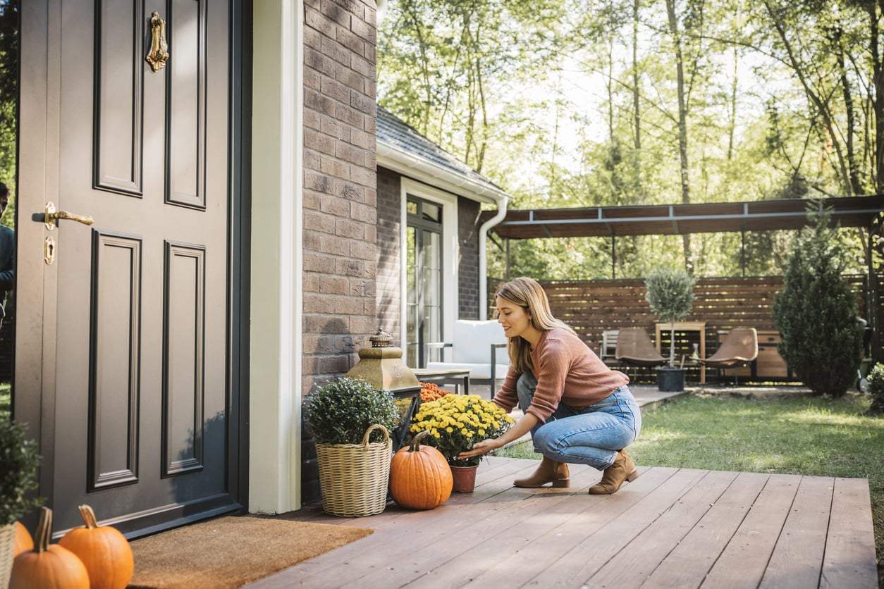
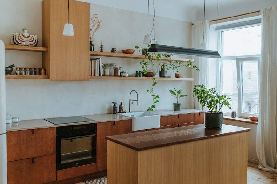
Warm colors like red, orange, and yellow usually represent passion, energy, and creativity. These shades can even boost appetite, making them popular choices for dining rooms and kitchens. Red, for example, can raise your heart rate and increase excitement. Orange sparks creative energy, while yellow lifts your spirits and spreads positivity.
But keep in mind, these colors can be draining if overused. Too much bright red in a bedroom might make it harder to relax and fall asleep. That’s why it’s best to use warm tones as accents—creating the mood you want without overwhelming the space.
The Soothing Effect of Cool Colors
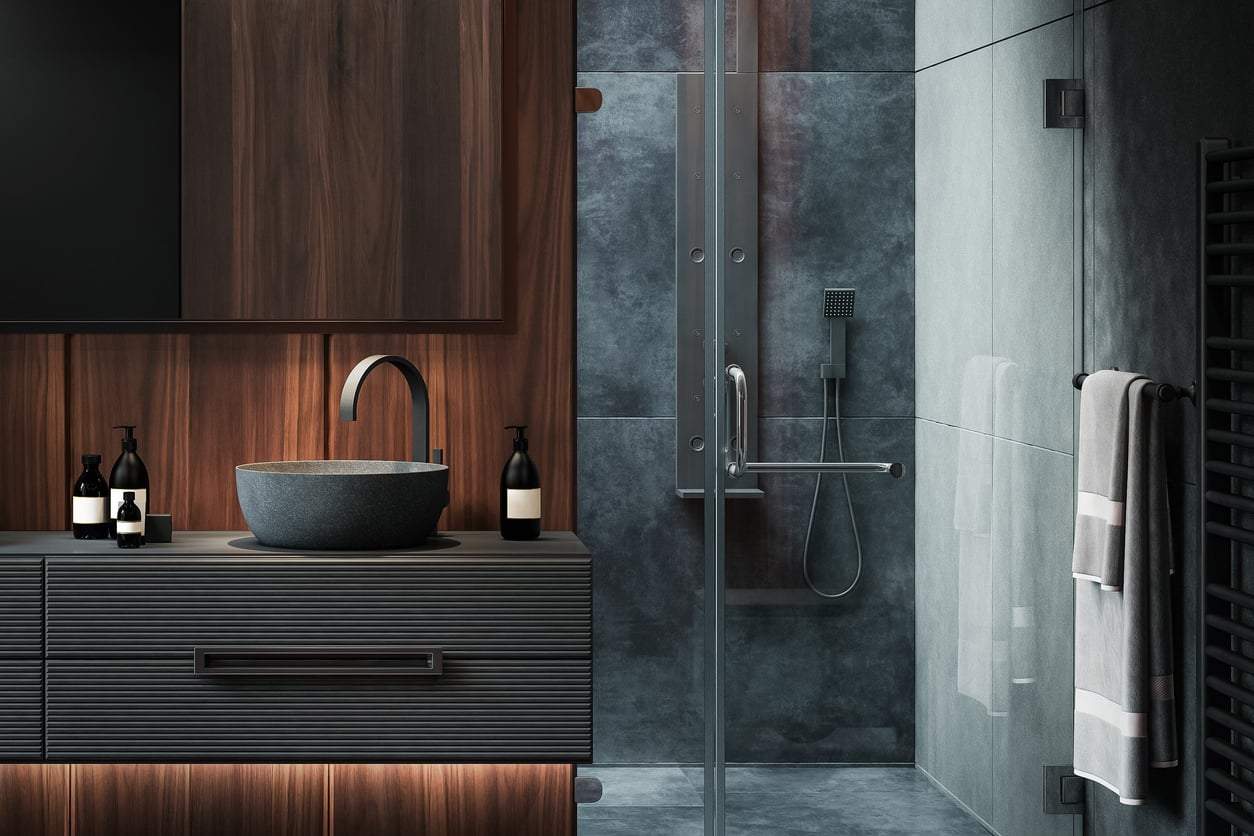
Cool colors like blue, green, and purple bring calm and peace. Blue creates a restful, cool atmosphere—perfect for bedrooms or bathrooms. It’s also a favorite in offices because it helps maintain focus and reduces stress. Green evokes relaxation and a natural vibe, making any room feel friendlier and more balanced.
Purple is a bit more complex: it’s both luxurious and mysterious, often linked to spirituality and wisdom. Used thoughtfully, it can add richness and elegance. But too much might feel cold and distant. To enjoy these special qualities, balance purple carefully throughout your home.
Neutral Colors and Harmony
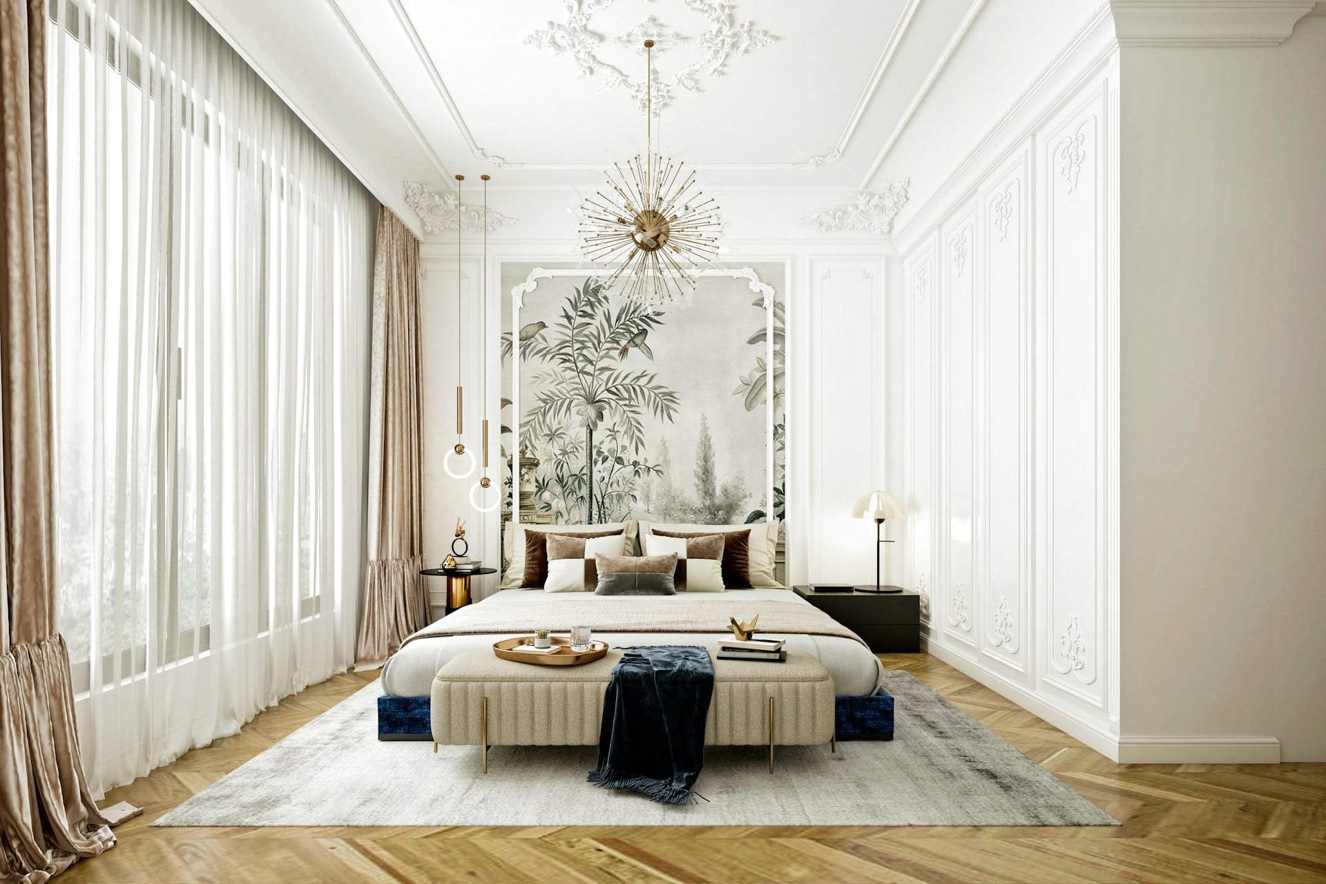
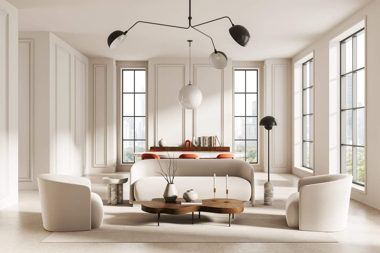
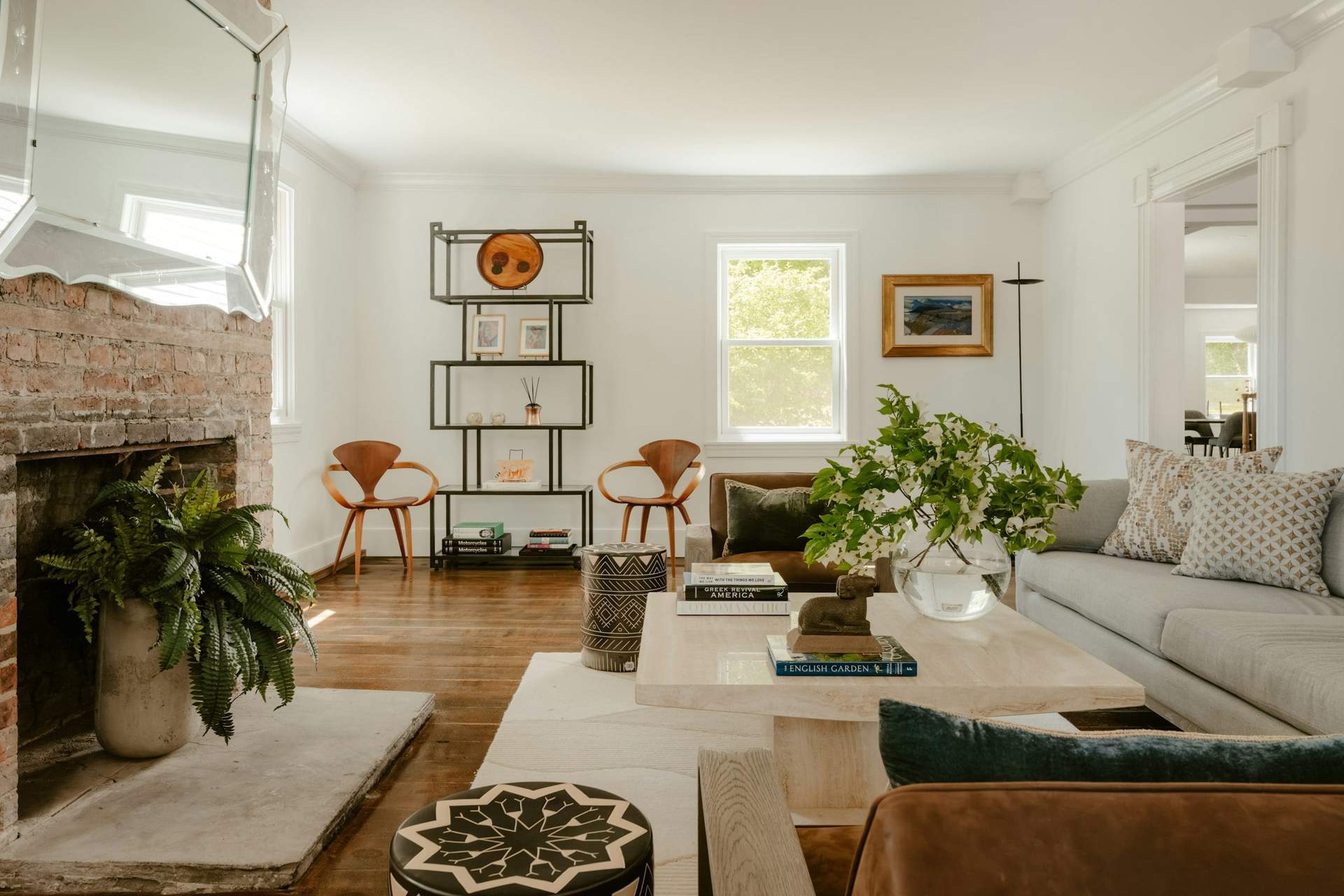
Neutral colors like gray, beige, and white are all about creating harmony. They provide a perfect backdrop for personal touches and decor, while making spaces feel larger and more open. Gray conveys calm and balance, lending a modern, minimalist vibe to any room.
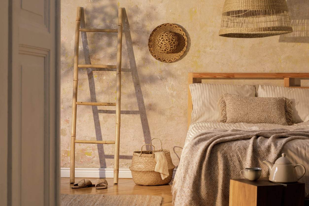
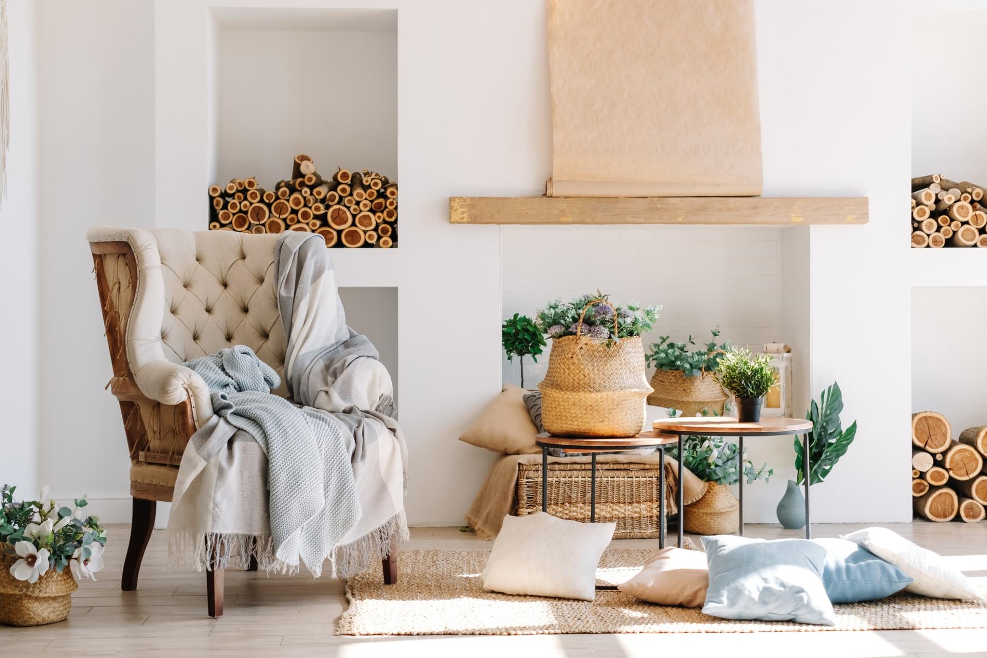
Beige adds warmth and coziness, while white brings a sense of cleanliness and freshness. These shades are ideal for smaller rooms where you want to brighten the space. Though simple on their own, neutrals can beautifully highlight accent colors when combined thoughtfully.
Bold Colors
Bright colors can be polarizing—some people love their vibrant impact, as these tones highlight parts of your home with energy. Shades like turquoise, pink, or lemon yellow can instantly lift the whole room’s mood. Pairing bold colors with neutrals helps avoid sensory overload and keeps the balance just right.
Thanks to their lively vibe, bold colors often shine in modern or youthful homes. If you enjoy daring, standout choices, try combining gray walls with bright blues or greens for a unique, exciting space. These tones let your home’s personality and your own energy truly shine.