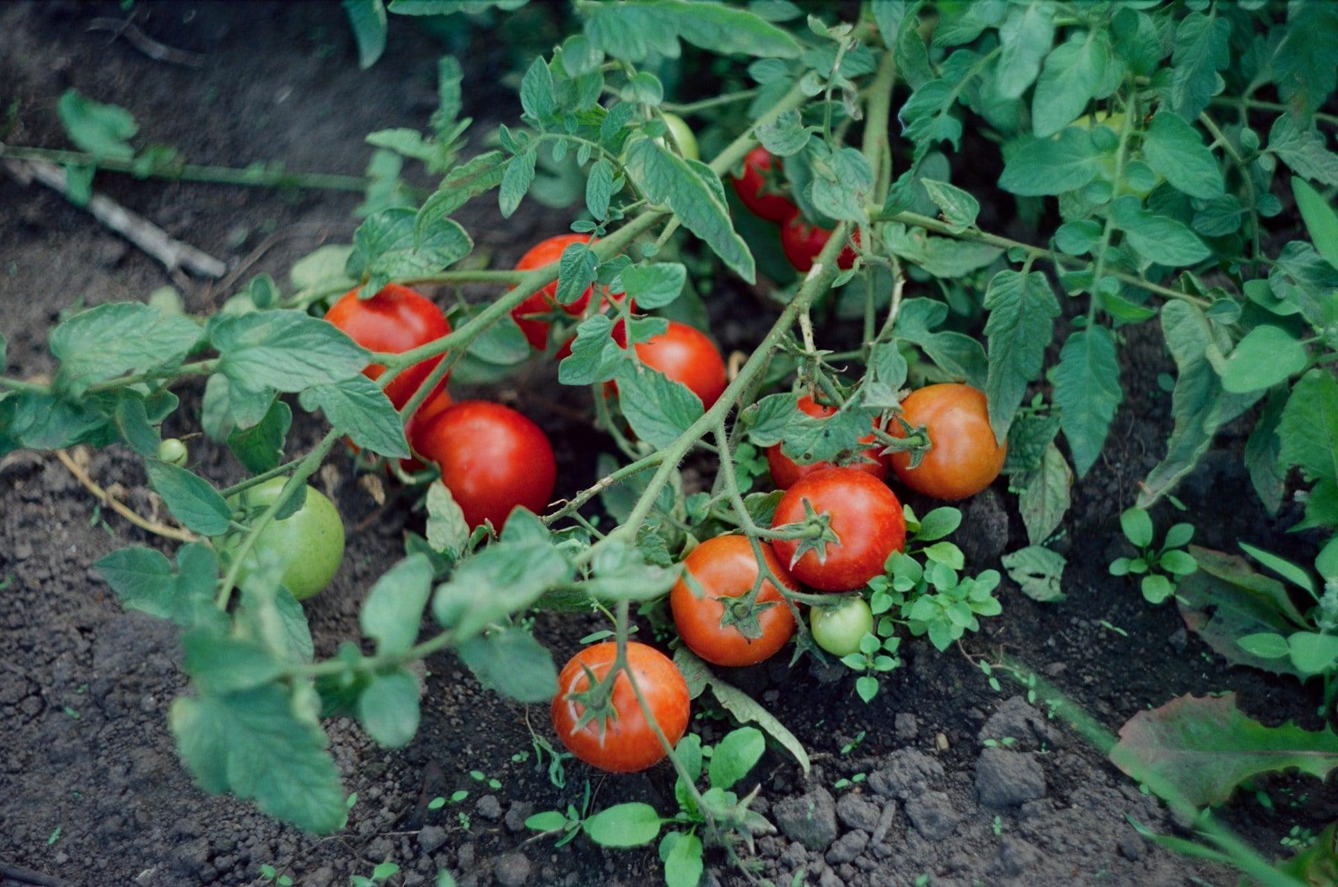
And let it be used. The blue-and-white kitchens I love best have a jar of wooden spoons that don't match, a corkboard of postcards, a half-full bowl of tomatoes ripening on the windowsill. The scheme is old enough to have survived every trend cycle going precisely because it was never a trend; it was the colour of everyday china for generations, on tables where people ate dinner.
What blue works in a kitchen with very little natural light?
In a dim kitchen, go deeper rather than lighter. Pale, chalky blues need daylight to look fresh and tend to turn grey and sad without it, whereas a deep ink, petrol or slate blue on the lower cabinets looks intentional and cocooning in poor light, especially with warm white walls above and warm-toned bulbs. Add reflective surfaces — glossy tiles, a mirror, polished brass — to bounce what light you do have.
How do I mix blue-and-white patterns without it looking busy?
Keep one pattern large and one small, and repeat the same blue across both so your eye reads them as a family: a broad stripe on the blind with a fine check on the seat pads, for instance, or bold transferware plates alongside plain white bowls. Leave genuine empty space between groupings, and if a shelf starts to feel noisy, remove the third pattern rather than adding a fourth thing to balance it.